
Case study
Work Life: A new editorial experience for Atlassian’s brand content

Visit the live site, Work Life
Part 1: A new home for brand (aka thought-leadership) content
A blog is a prerequisite for any modern company, but the way they’re used differs widely. Some companies simply use their blog for corporate updates , some use them for product releases and tutorials, and others use them for thought-leadership so as to connect their offerings with bigger ideas and movements that pertain to the problems they solve. Historically, Atlassian’s blog included all three of these subject matters, and after several years, the content of our blog was a messerschmitt of content which wasn’t really owned by any one group in particular. As a result, the blog hadn’t successfully built a dedicated audience and it certainly wasn’t driving product trials or brand loyalty.
Who really owns the blog?
Our newly formed editorial team had a goal to build a dedicated subscriber audience for a publication that was largely based on thought-leadership around teamwork. It seemed like a straightforward task because content about teams, culture, and productivity was certainly the highest performing content on the blog. However, the blog’s wide range of content complicated things. Ownership over the content varied wildly between editorial, public relations & communications, and product marketing. It left us asking ‘who really owns the blog?’ Product marketing didn’t want to lose their trusty channel for releases and editorial didn’t want that content diluting their new objective, so we had to find a way to either split the content into two distinct sites or find a way for all of this content to live happily together on a single platform to work for every visitor.
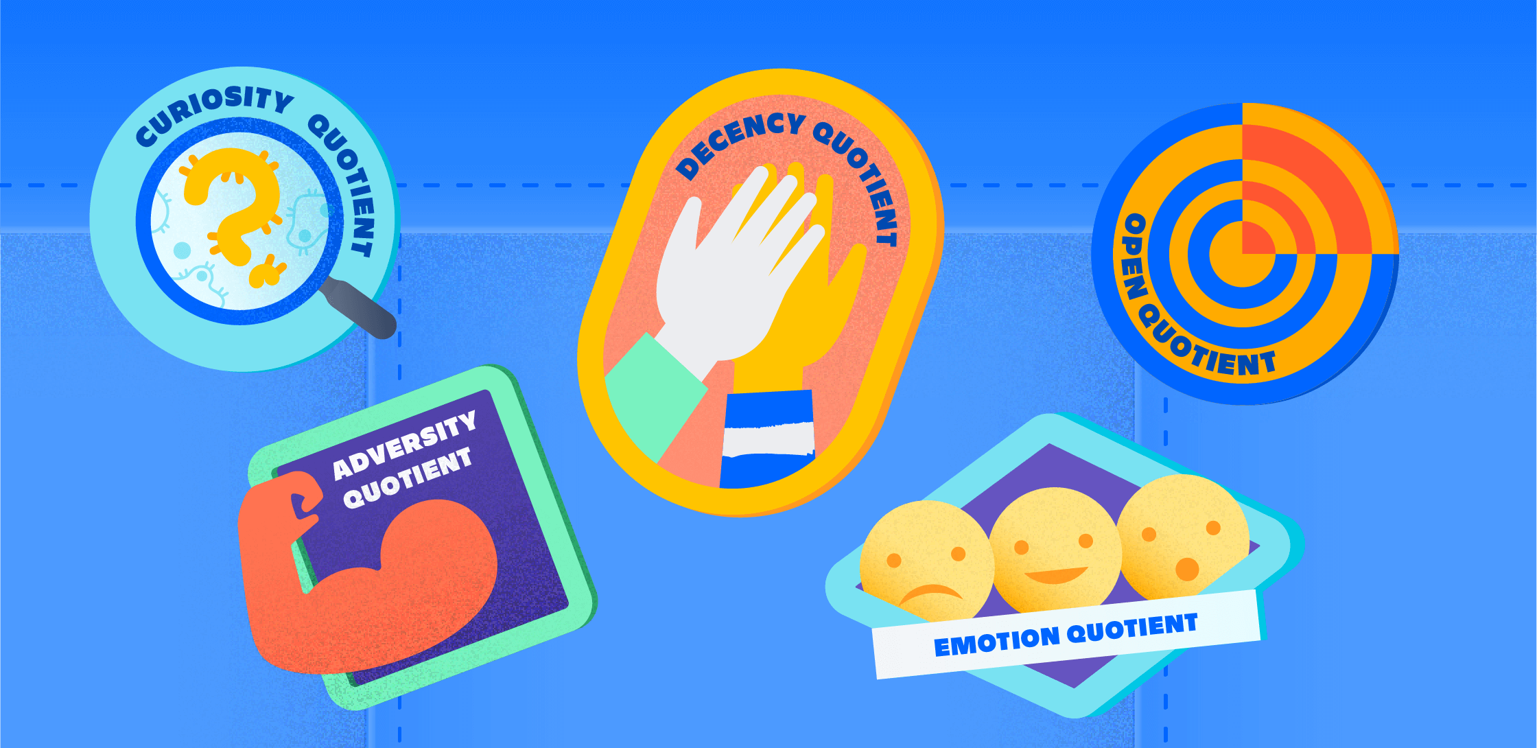
Additional data points
Of all product marketing posts, only 25% drove traffic to product tours or evaluations.
2% of published articles accounted for 98% of traffic to the site. These posts were of the thought-leadership variety.
Articles for "agile", "git", "continuous delivery", or "ITSM" had dedicated microsites to these industry topics, so most product content was news related, not productivity.
75% of traffic to the blog was organic and 30% were new visitors, so it was safe to assume that most visitors did not have a strong understanding of the Atlassian brand.
Due to SEO concerns, there was a heavy preference to not remove URLs from the existing blog.
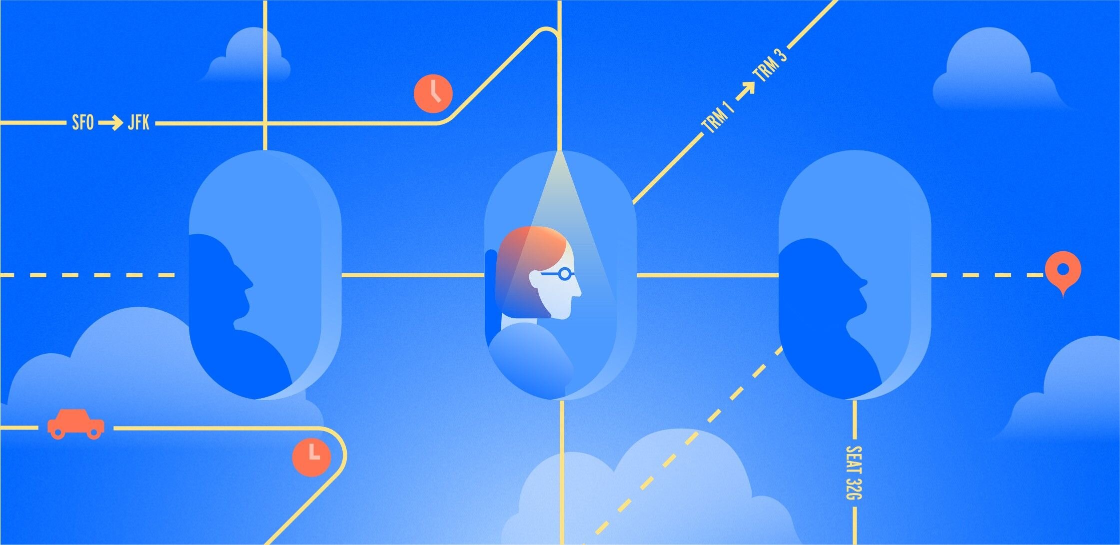
An adjoined rooms approach to IA
As a team, we weighed the pros and cons of several high-level information architecture directions, but after assessing the needs and nice-to-haves of all parties, we made a decision to proceed with a direction that allowed for the content to coexist on a single property. We felt that with the right design this solution could benefit all parties—product marketing wouldn’t be on their own to self-organize around a new channel, while editorial could continue to take advantage of the existing SEO and maintain some governance over Atlassian publications without being on the hook for writing and editing technical articles. Best of all, users could arrive at either property and easily find the content that was relevant to them.


Navigation
Now that everyone was aligned around the vision, we were freed up to iterate on the information architecture and the experience of moving between the two areas of the site. We looked at several ways to solve this, such as a ‘product’ category amongst the other ‘teams & culture,’ ‘leadership,’ categories. This quickly made the navigation tricky due to our ever growing list of products as well as the variety of intentions that different users have when visiting the site. We landed on a solution that we described as adjoining hotel rooms—distinct spaces in the same building with an easy access passageway between (and with the same decor).

Various navigation explorations
While slightly unconventional, this allowed us to treat the navigation of the two sections differently. The product section would constantly be in flux due to the fact that we acquire, build, and sunsett products fairly often, so we needed a navigation that could adapt. Also, the product section wasn’t nearly as curated as the brand content, so this solution gave us the opportunity to treat it as more of a feed rather than a publication. Most importantly, it gave us a clean new space to house the thought-leadership content that we wanted visitors to associate with Atlassian.

Final navigation pattern
Work Life is born
While we fleshed out the final navigation patterns, the editorial team got to work on a name for their new publication and I explored a look & feel for the new site. After much deliberation, we branded the new blog Work Life and packaged up the remaining product and corporate content as the more straightforward Products & News.
We explored a few visual design directions that aligned with the vision statement for Work Life:
For the knowledge worker, who wants to thrive in an environment of constant change, this publication provides actionable advice, inspirational stories, and trusted expertise about work life today.

It was important for our look and feel to let the content be the hero. We also wanted the layout to lend itself to packaging up stories into categories and collections. Ultimately, the aesthetic of the design was set up to be rather simple, with certain secondary elements living within the details through typography and/or color.
We narrowed in on the design that lent itself to an academic or traditional editorial feeling, using visible rules to divide up content and a bold treatment of our bespoke typeface, Charlie Sans (that we couldn’t get away with in our normal marketing content). These elements gave the site a unique character that still felt like a child of the Atlassian brand.
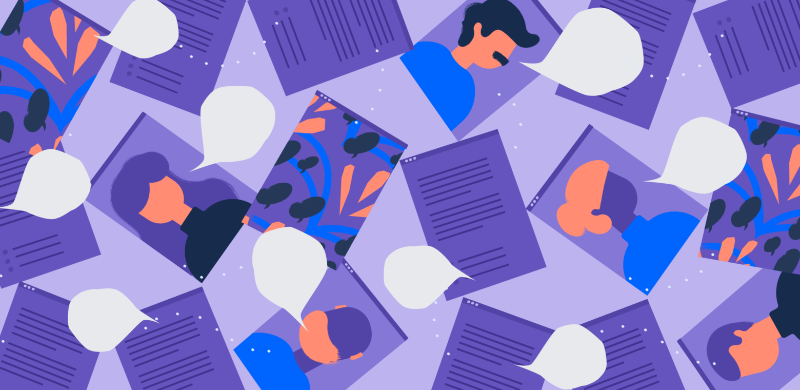
Components for days
With look and feel hardening up, it was time to get into the details of the site’s elements. It was important to the editorial team that users move seamlessly through relevant content based on stories they read, so cards needed to be modular enough to arrange into groups like collections and ‘related stories’ across both Work Life and Products & News. In order to avoid duplicating work, we designed the components in an atomic way which allowed a relative few number of components to create several page templates like the homepages, category, collection, article, and search pages.
We worked with an external agency, Reactiv, to do the development work. I handed off components and layouts in 1-week batches over 4 weeks.


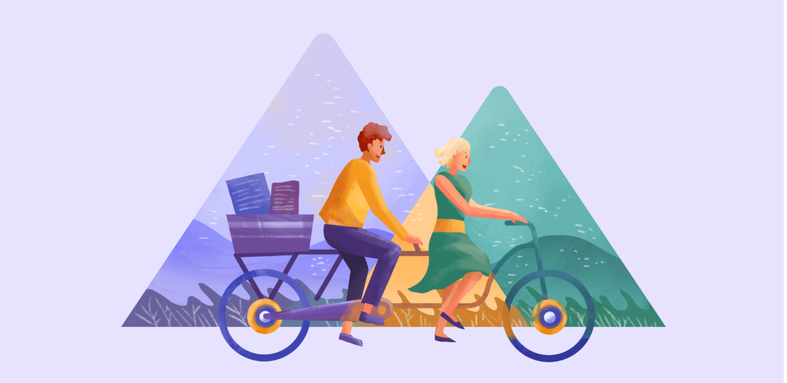
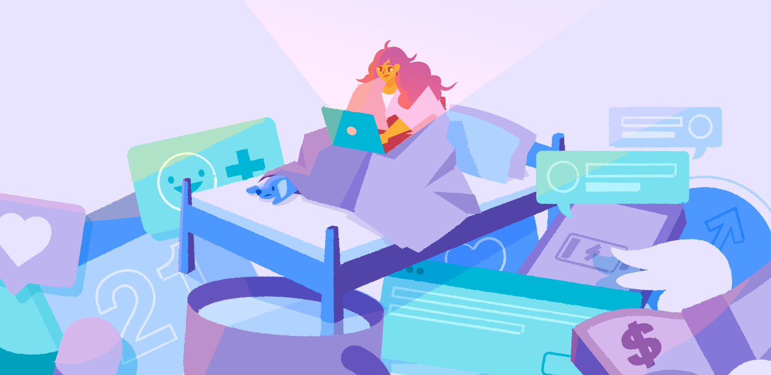
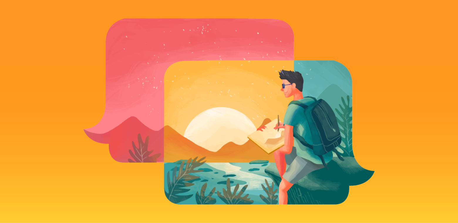
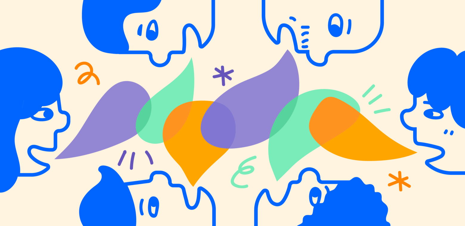
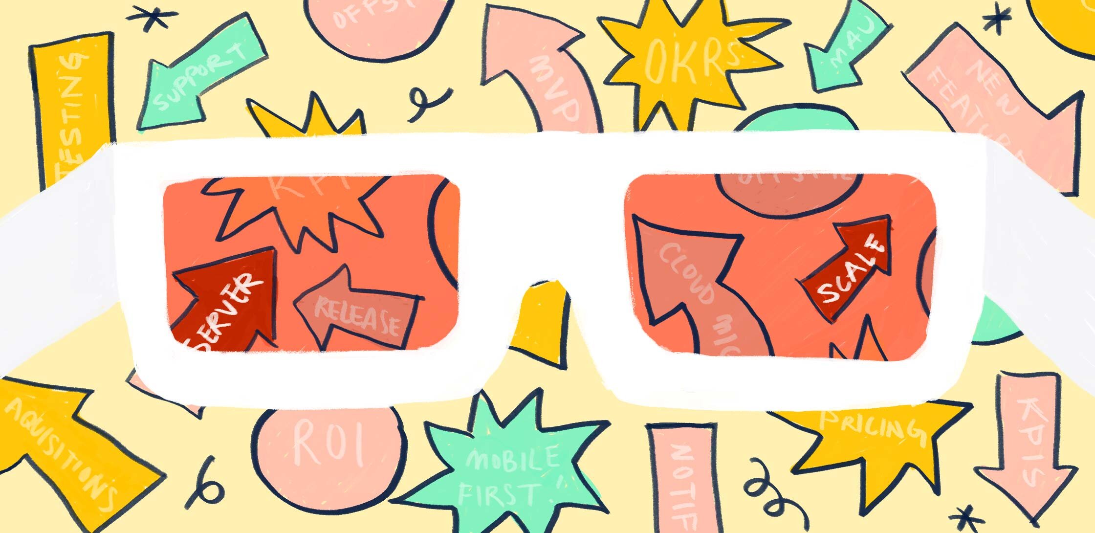
Part 2: Telling stories visually (aka editorial illustration)
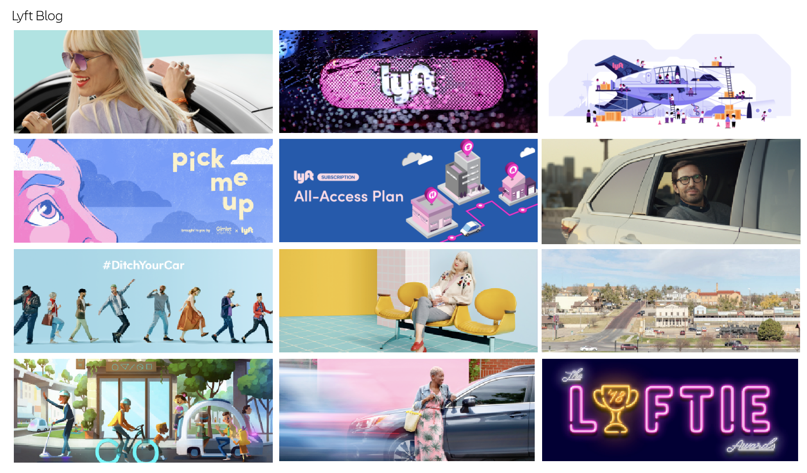
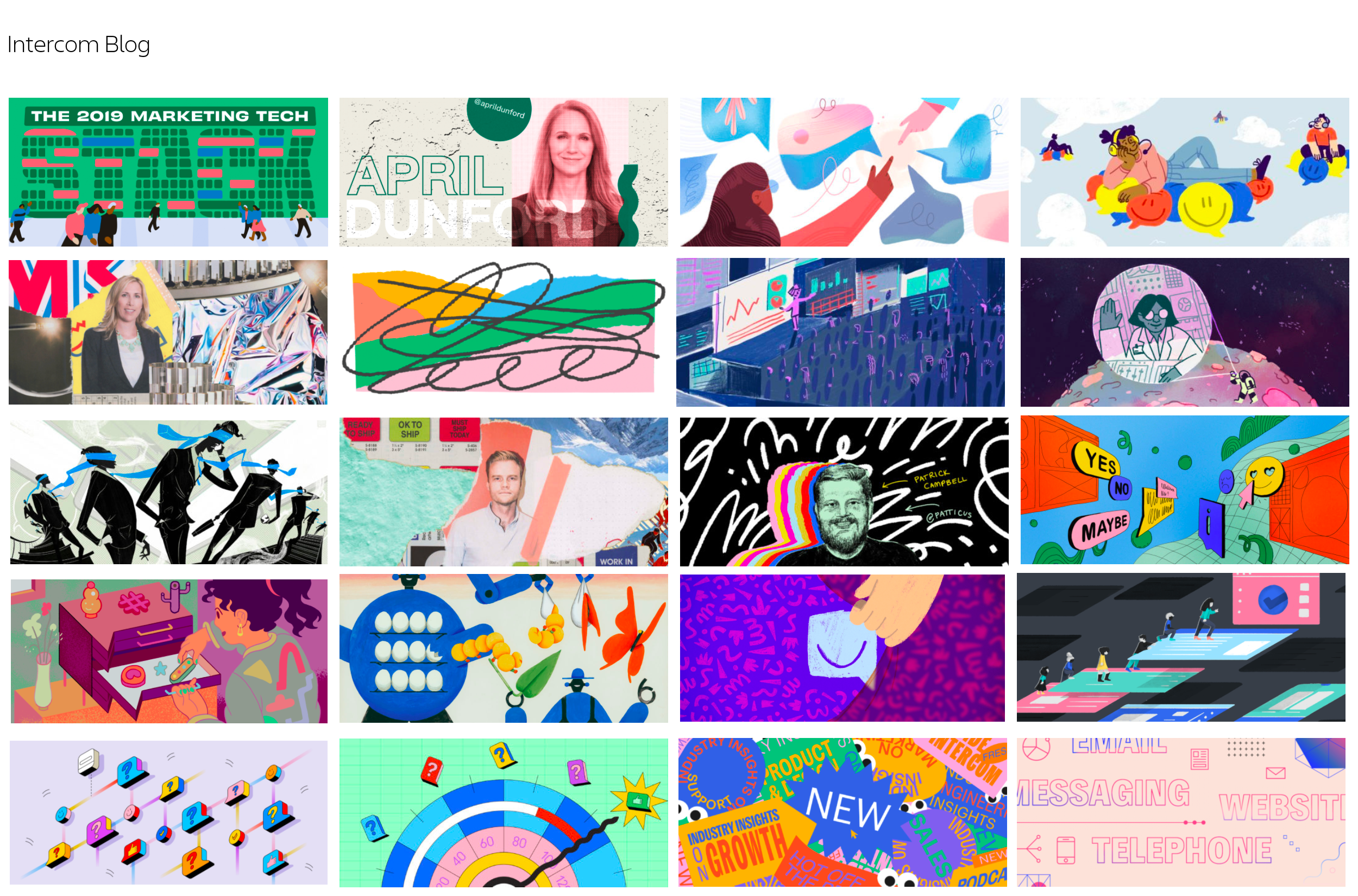
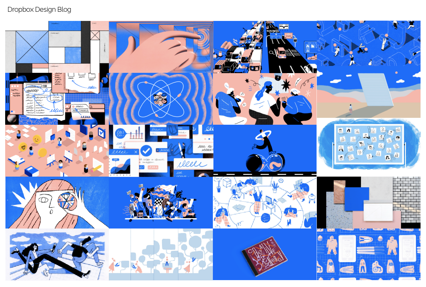
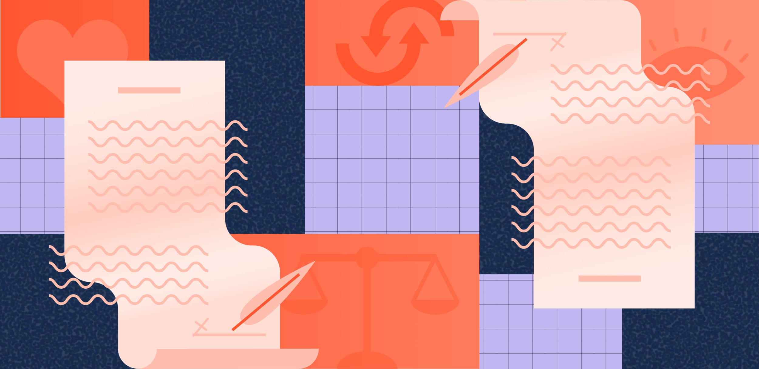
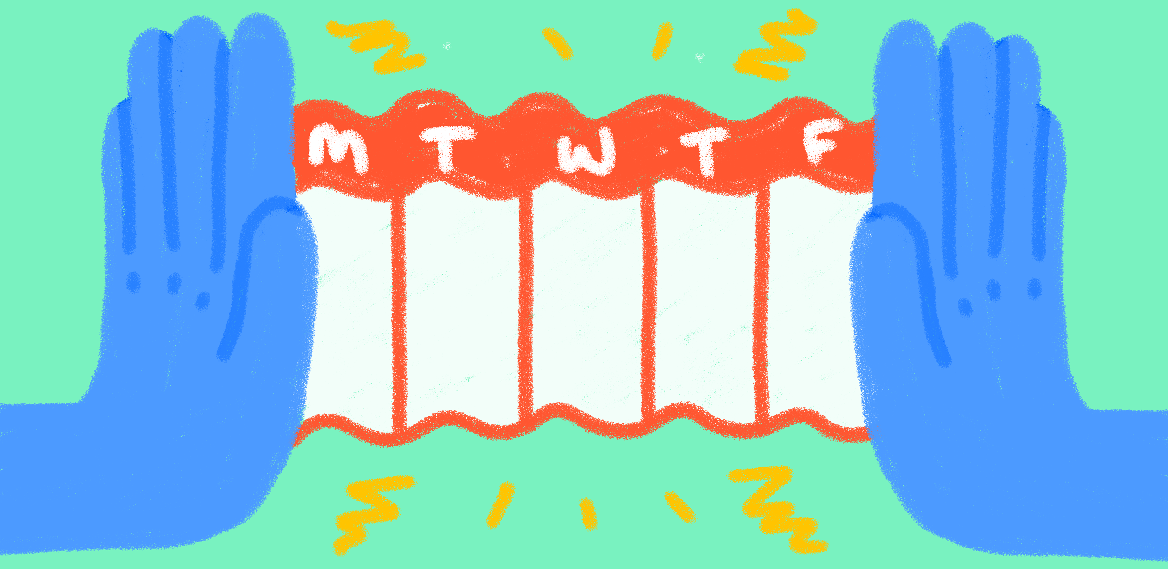
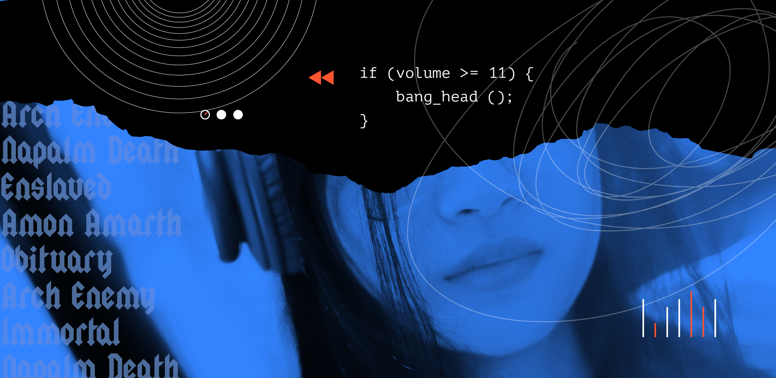
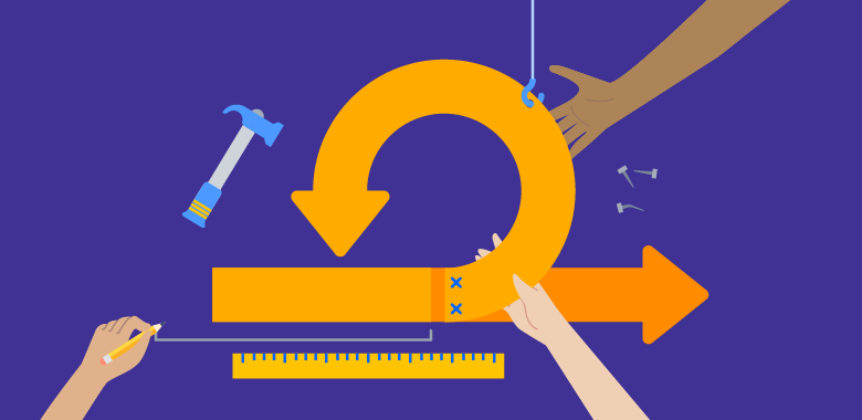
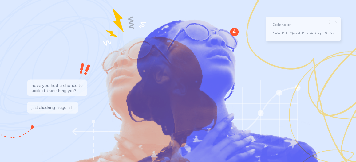
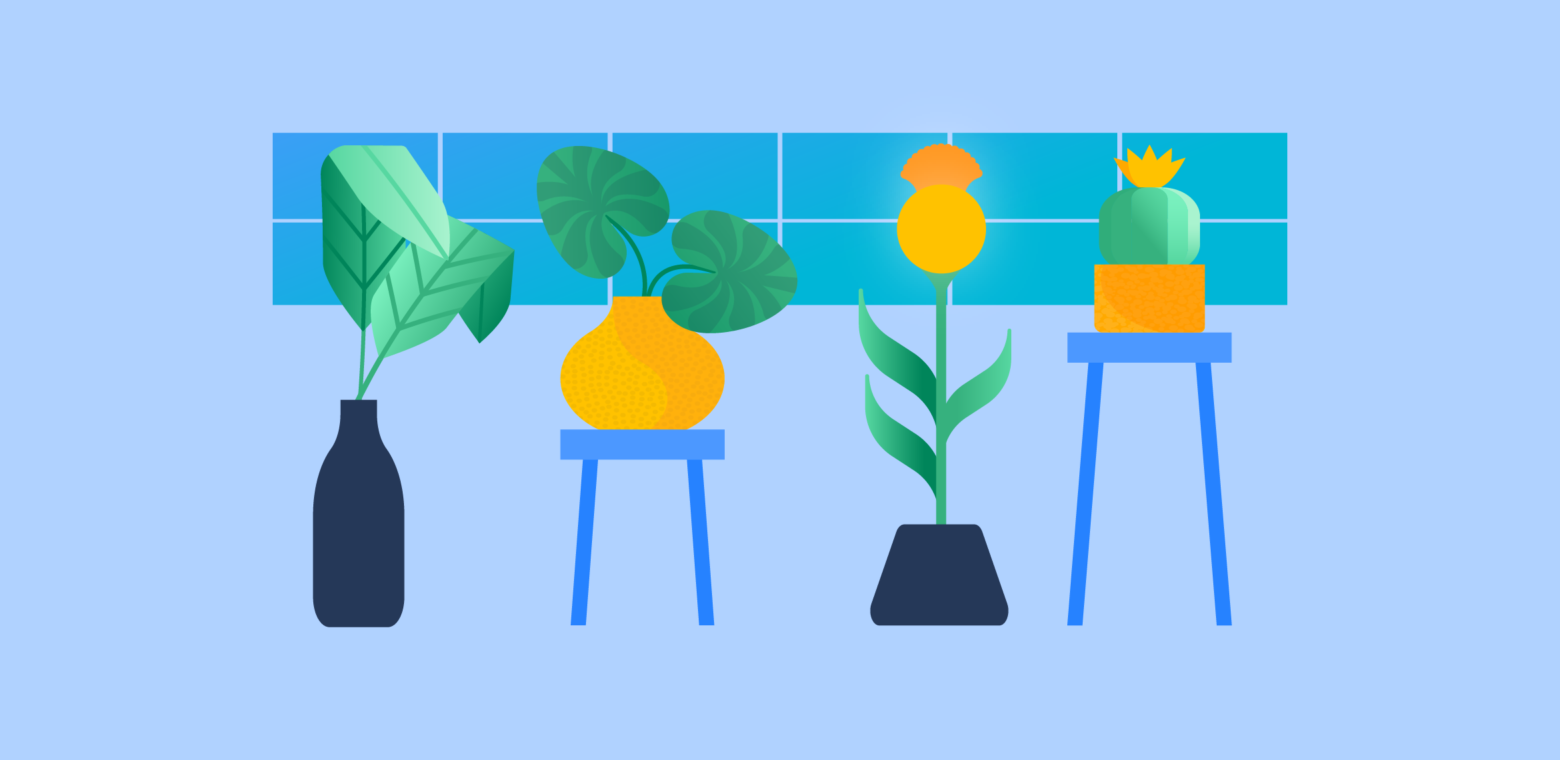
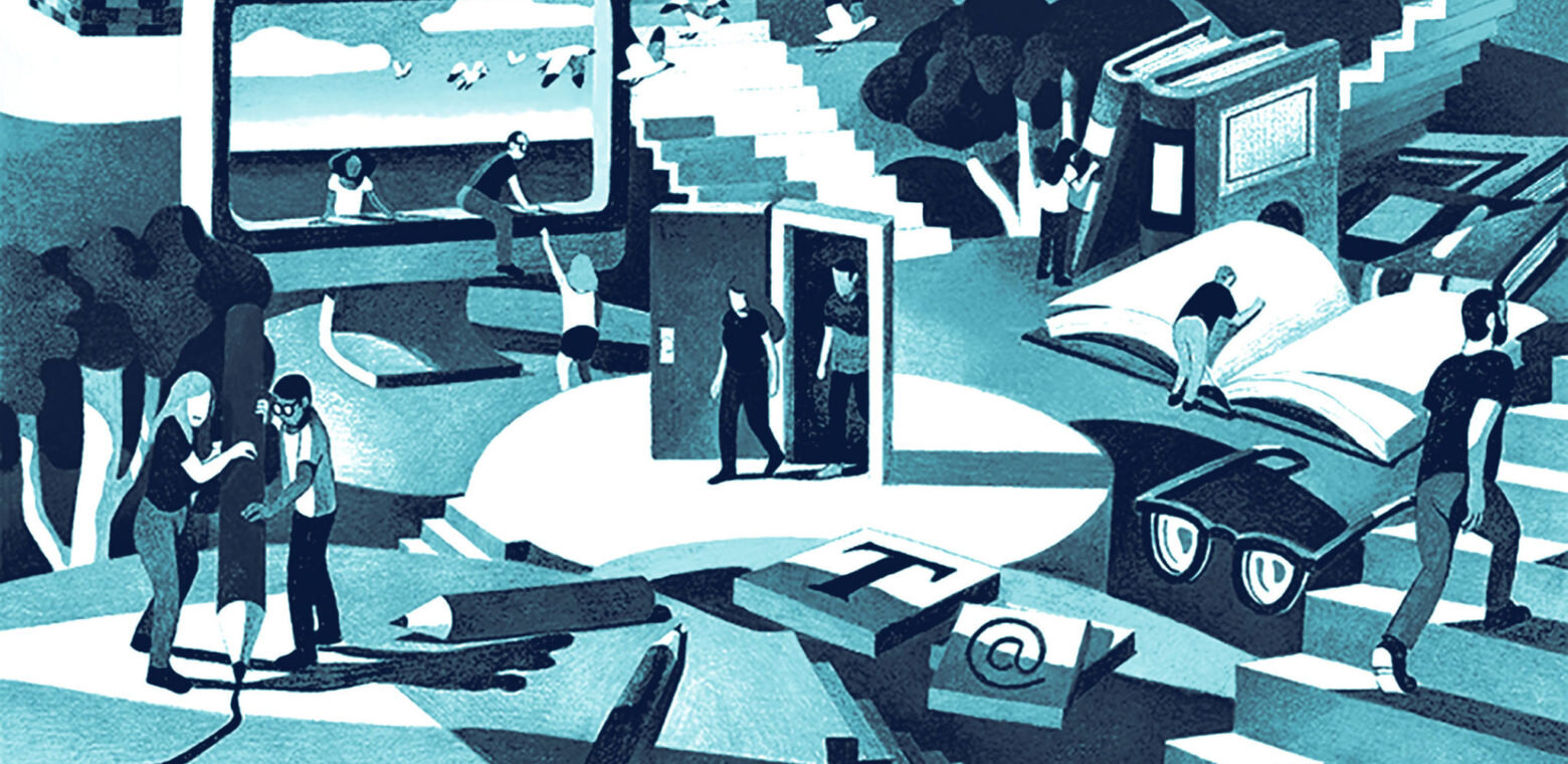
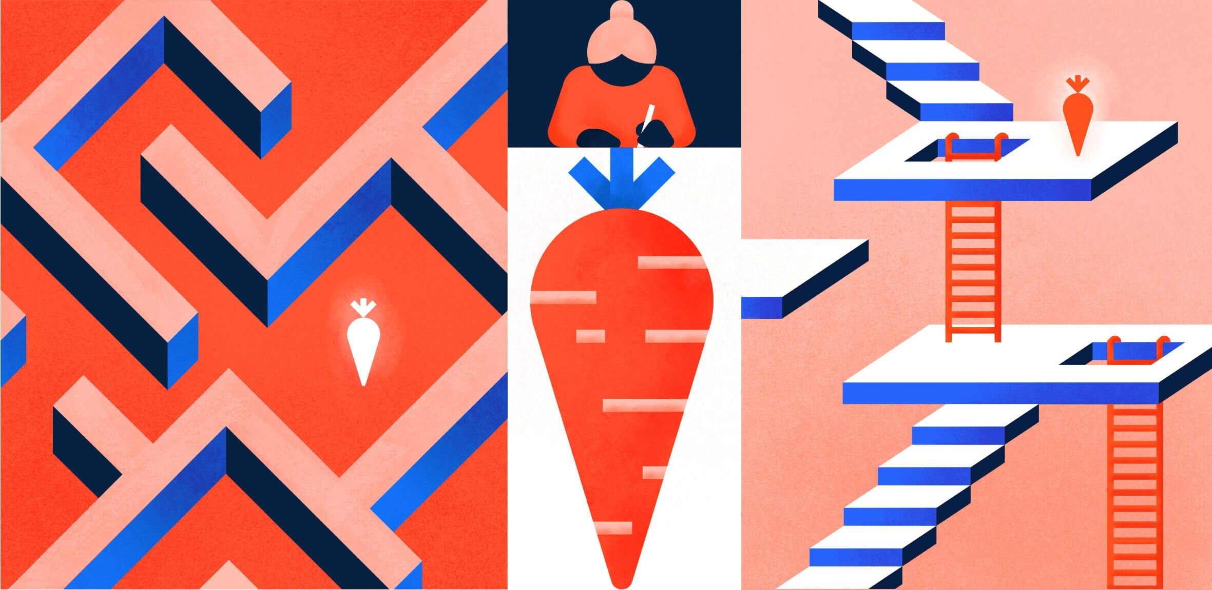
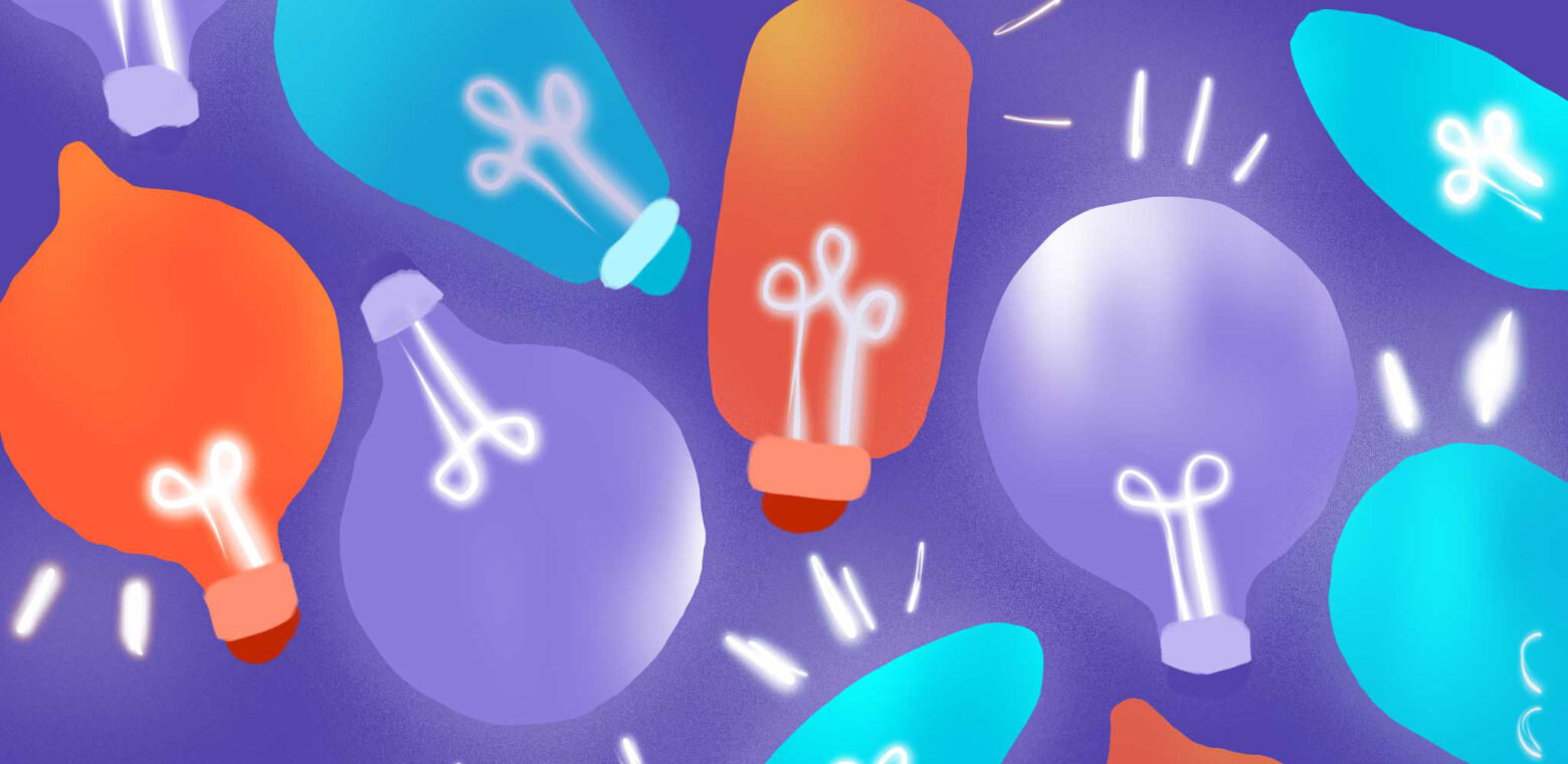
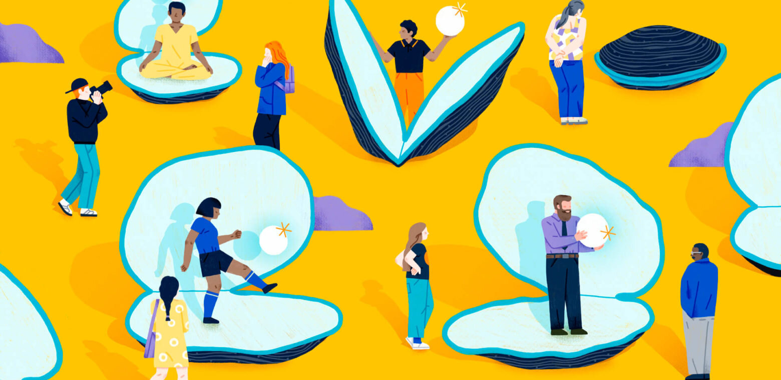
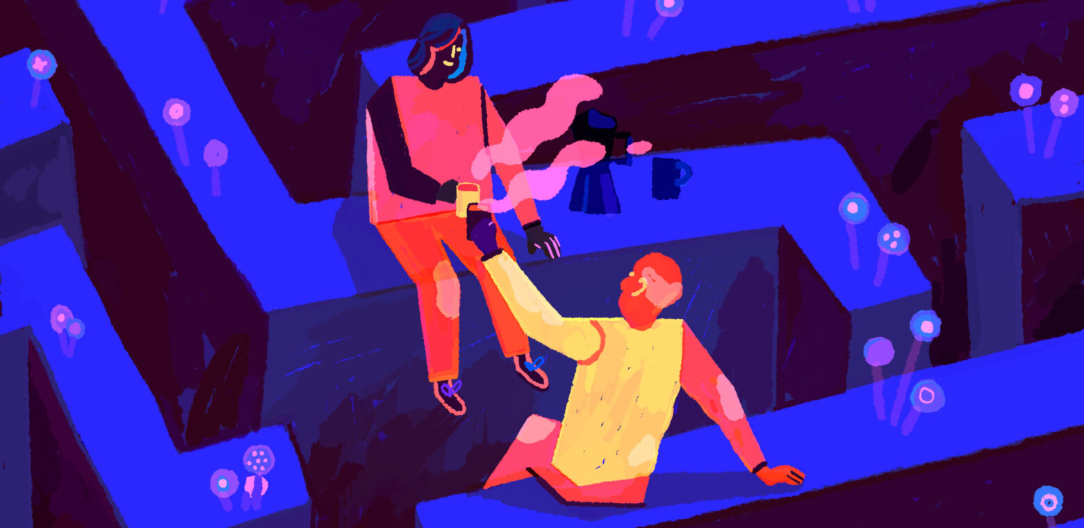
With a new vision for the blog, we needed a new outlook on our editorial illustration approach. Previously, we pulled from our house illustration library which was problematic for a few reasons—primarily that we were quickly exhausting the library. It was difficult to keep the imagery that accompanied the articles fresh considering we were pushing out 2-3 articles per week, and The editorial team had an ambitious goal of doubling it with the new blog launch along with a significant overhaul to their social strategy. Our use of our brand illustrations didn’t perform well, and we hypothesized that the visual storytelling looked homogenous, was indecipherable from our paid advertising, and didn’t support the titles as well as they could. Because each article is stand-alone (except for series articles), we saw this an opportunity to break free from our house style and allow the content of the articles to dictate the subject matter and mood of the artwork. We were also curious about how a more varied style of imagery would affect the performance of the articles on social and we were, perhaps selfishly, excited about the prospect of having a dedicated and contained proving ground for experimental expressions of our brand’s visual storytelling.
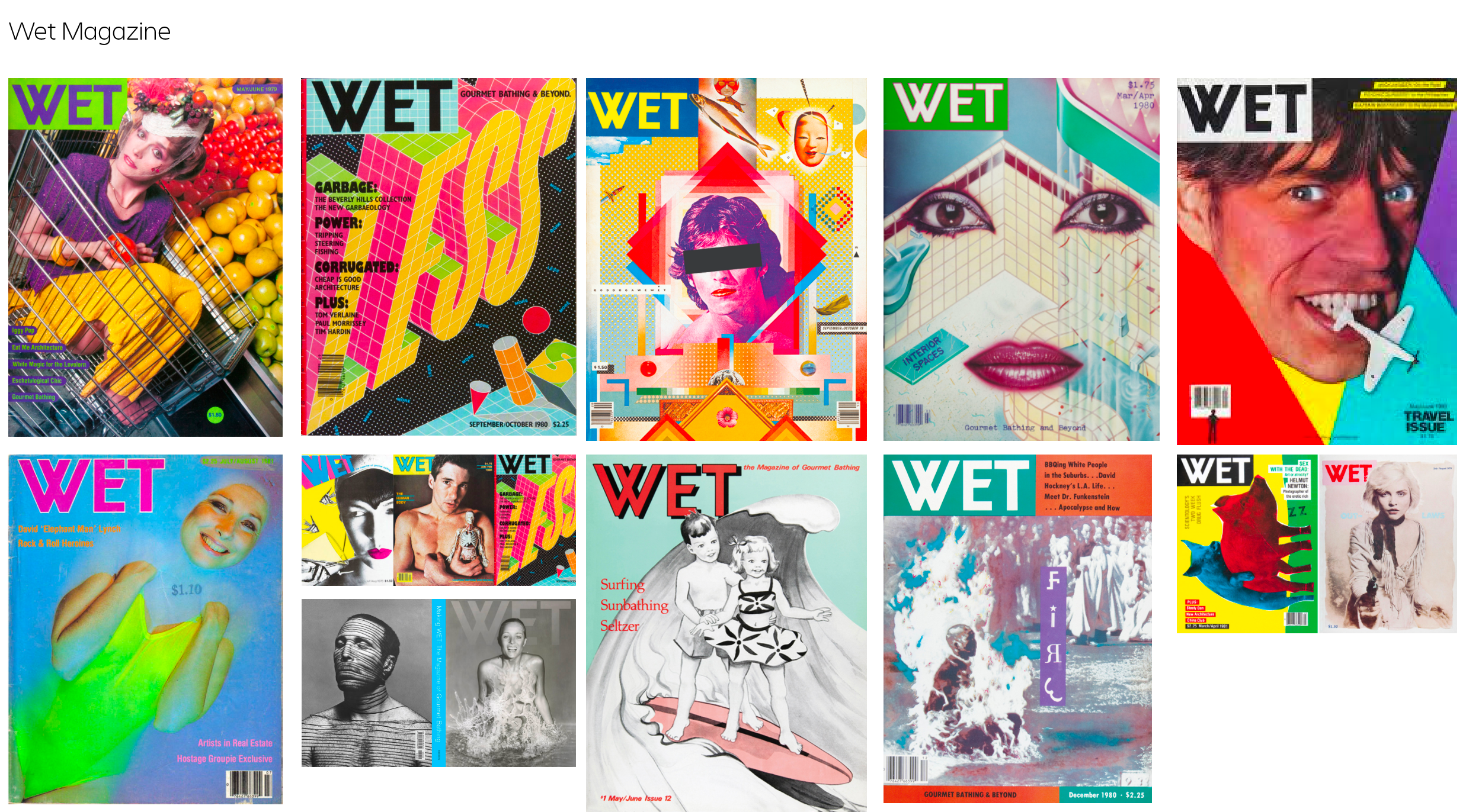
Our illustrator and myself partnered with our editorial team stakeholders to discuss the sensibility of the new blog artwork. We kicked off with a thorough audit of our peers and found that they ran the gamut of bespoke artwork to stock imagery to no imagery at all. We discussed the tradeoffs of different mediums, the level of flexibility we’d need in regards to process and timelines, and the range of content we’d be illustrating for on the blog (i.e. trend reporting, how-tos, opinion, storytelling, etc.).
Hacking the brand
Each quarter the Atlassian Creative Team spends a day together for a Hack the Brand day which is defined as: A 1 or 2-day Creative Team ritual that happens once per quarter. Every quarter the theme and parameters change—but the goal remains constant: break, evolve, shift, and challenge the Atlassian brand around topical theme.
Since we needed to go broad, we decided that and ‘editorial illustration’ theme would be a perfect way to spend the teams’ Hack the Brand day together. So we gathered the rest of our team of designers and writers for an exercise to define a sensibility for the artwork. We brought in the editorial team to brief everyone on the new vision for the blog and got to work.
We broke up into teams to discuss the aesthetic of competitor blogs as well as print publications that have a defined style or sensibility in their artwork.
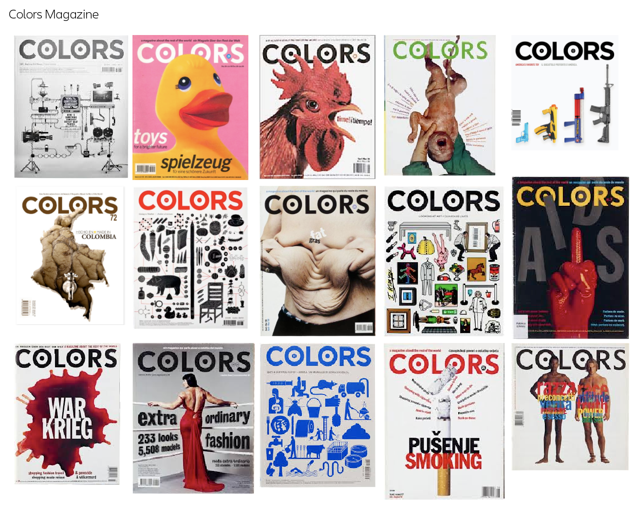
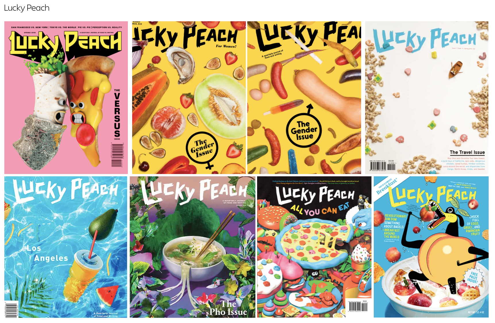
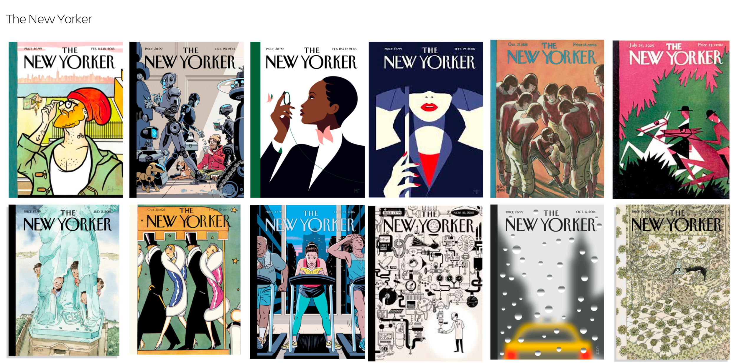
Each group was asked to evaluate an assigned moodboard:
Describe the sensibility in 3 words
How do you think this brand defines parameters? (i.e. how do they choose and brief their artists?)
What works well? What doesn’t? (i.e do you find the parameters limiting? Can you easily spot inconsistencies?)
Next, the groups evaluated existing Atlassian artwork from the previous year to identify opportunities to push our own sensibility.

The bulk of the day was spent creating new imagery for existing articles using the parameters defined in their respective groups. The parameters were to:
Have at least one common theme run through all pieces in the group
Make sure the style works well with our existing illustration style, color palette, typography, etc.
Consider the use of photography, illustration-library adaptations, low-effort/minimal time executions, hand-made (collage, painting, etc.), digitally rendered, animation, and/or type only
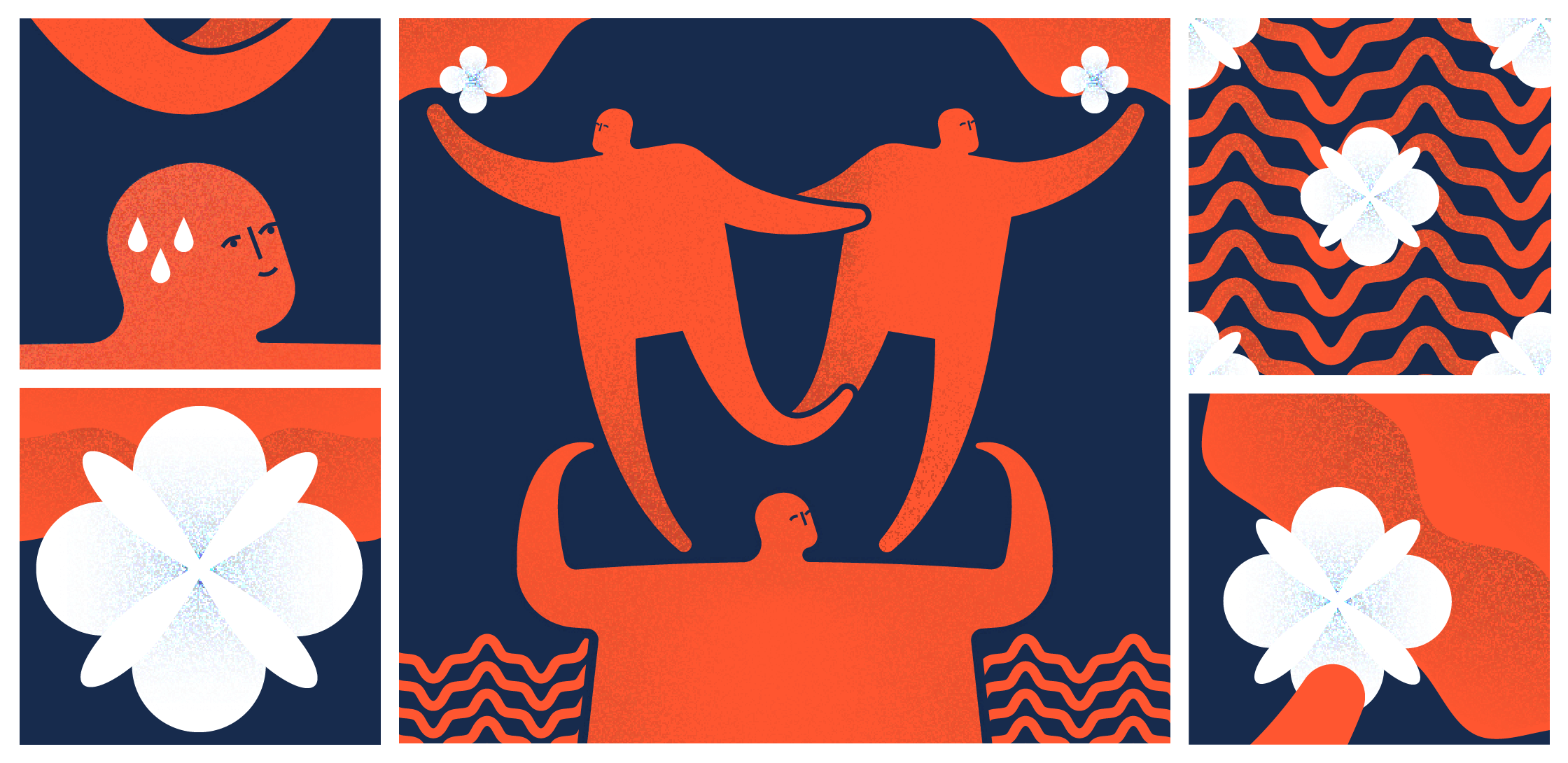
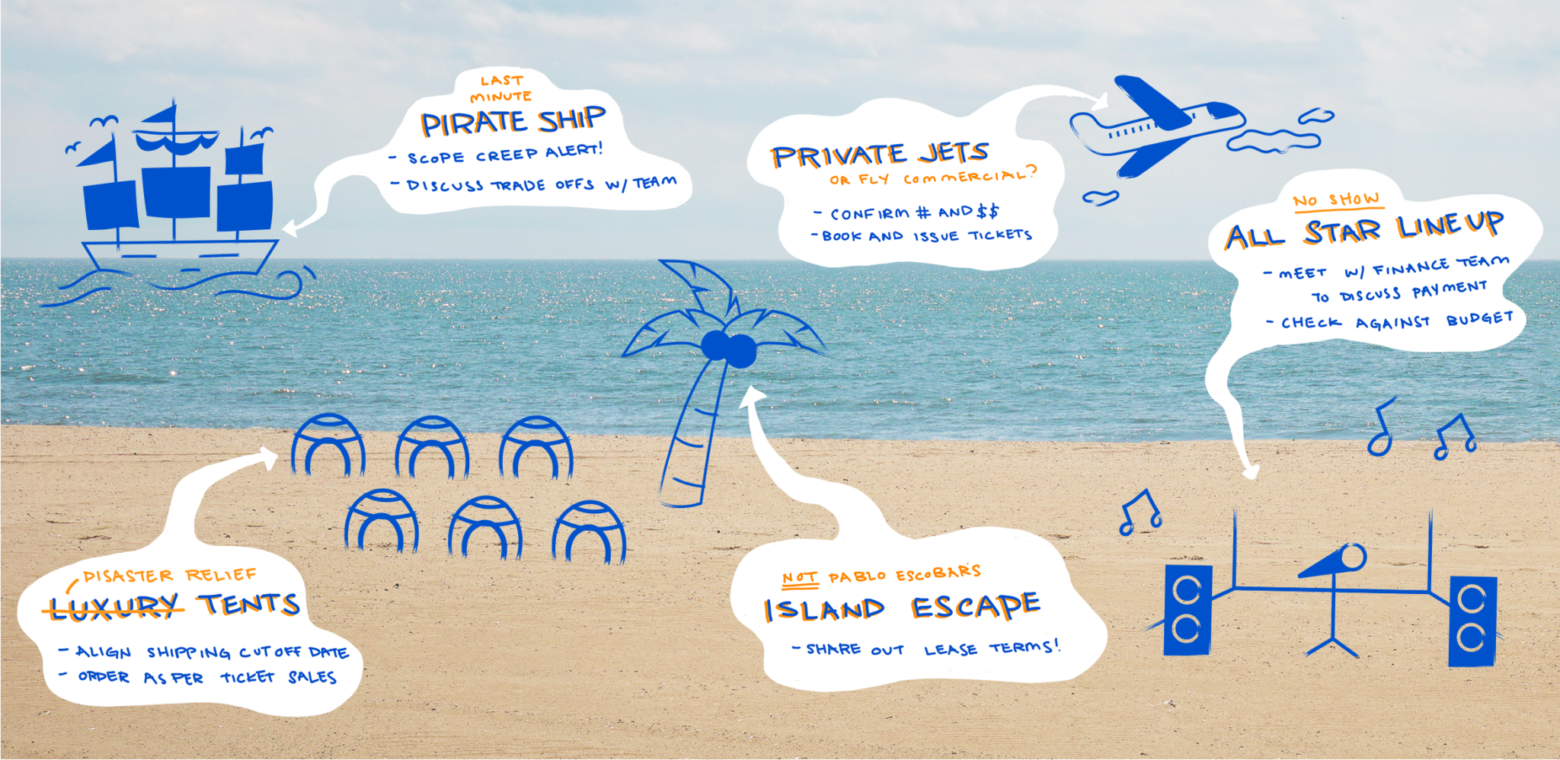
Output
The team came up with several interesting pieces to consider for our freshman class of editorial illustration. After presenting back to editorial and getting their feedback, we used the most successful pieces to launch the site and get some data back on their performance.
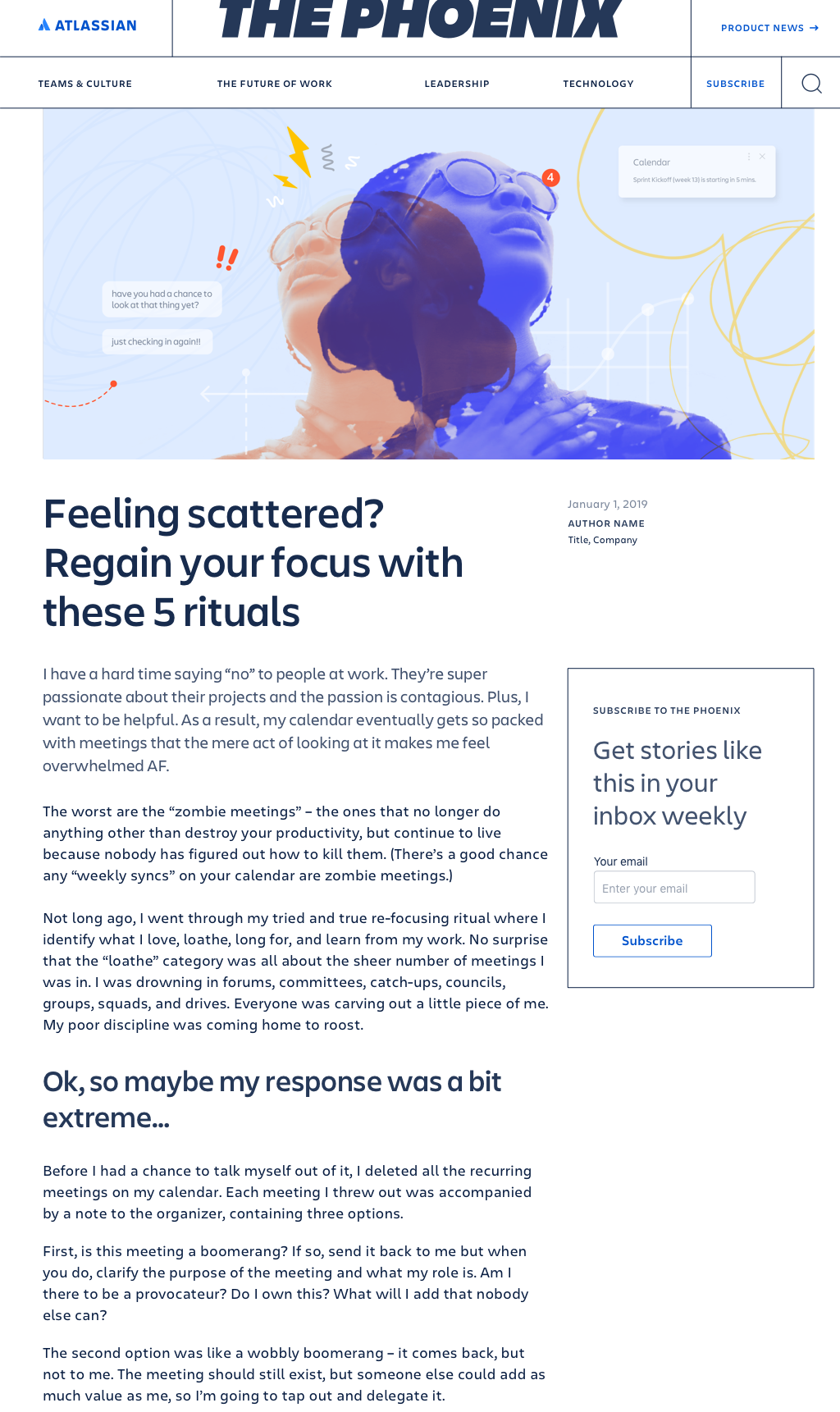
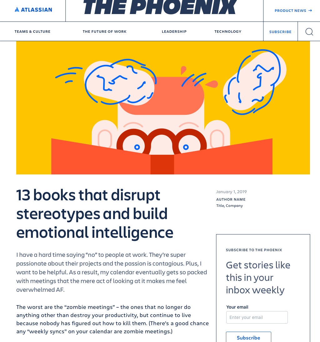
Note: ‘The Phoenix’ was the working name for the blog before it was officially branded ‘Work Life’
Evaluating & iterating over time
We continued to produce artwork,both in-house and with the use of external illustrators, through the launch and a paid advertising campaign that gave us more signal on the most successful pieces. Six months later we were able to sit down with a large body of work in order to hone our style a bit further.


We looked at the click-through data for each piece to determine the most successful and to see if any high-level themes were rising to the surface. We wanted to answer the following questions:
Which blog heroes are performing the best?* Known caveat being that many blogs performance is largely to do with the title as well
What categories or styles do we see organically forming on a continuing basis?
How might we more meaningfully curate those styles so that our aesthetic is constantly being fine-tuned?
Several categories emerged which we concluded should be further refined.
Recurring categories

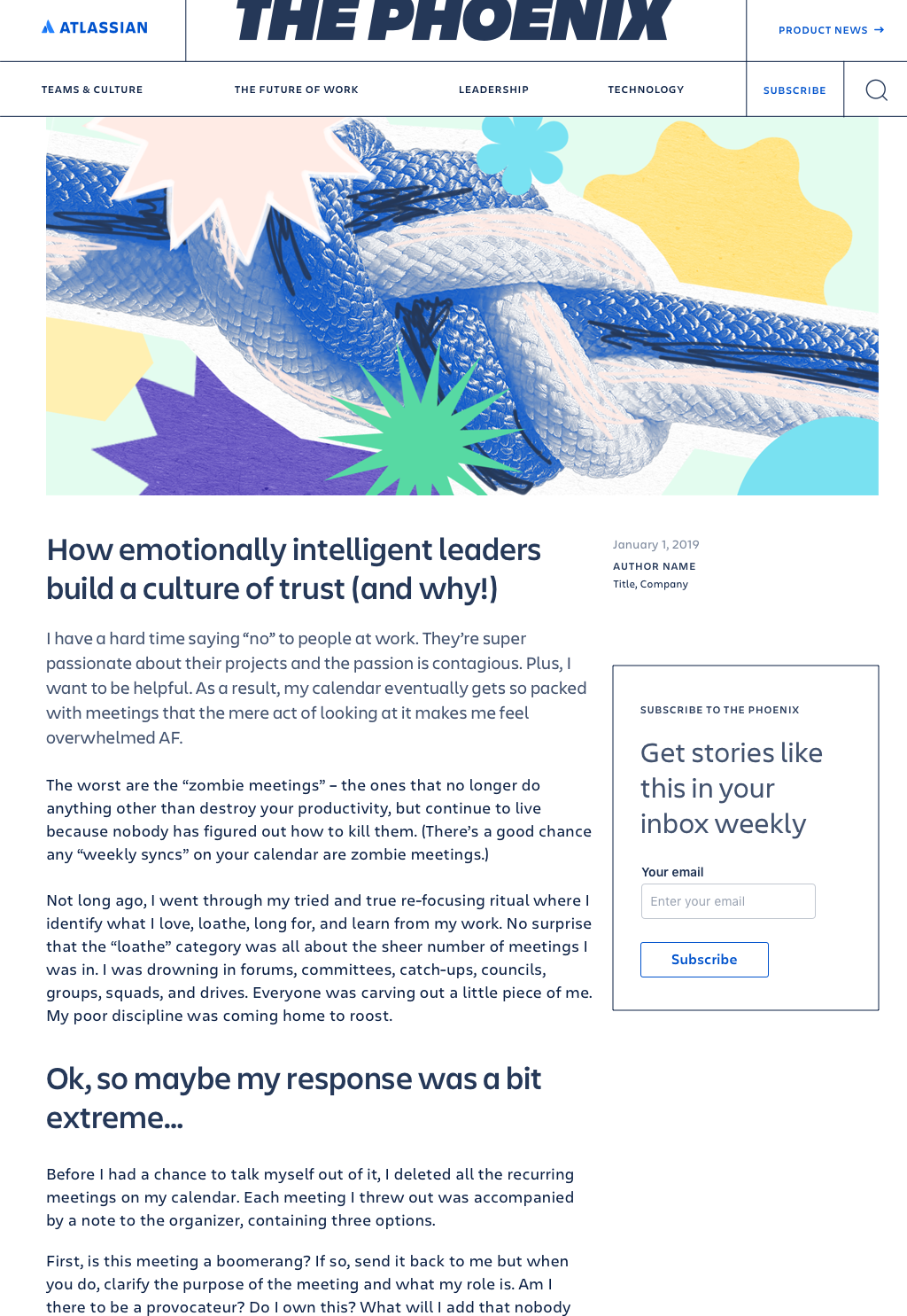
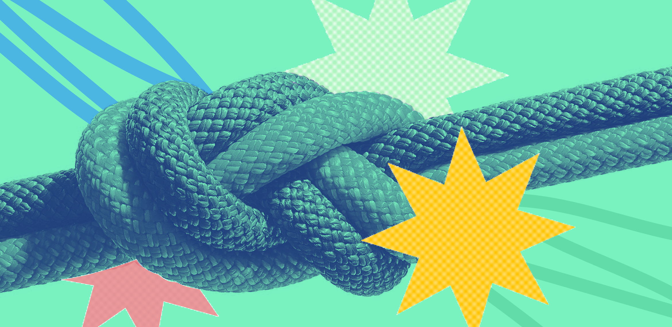
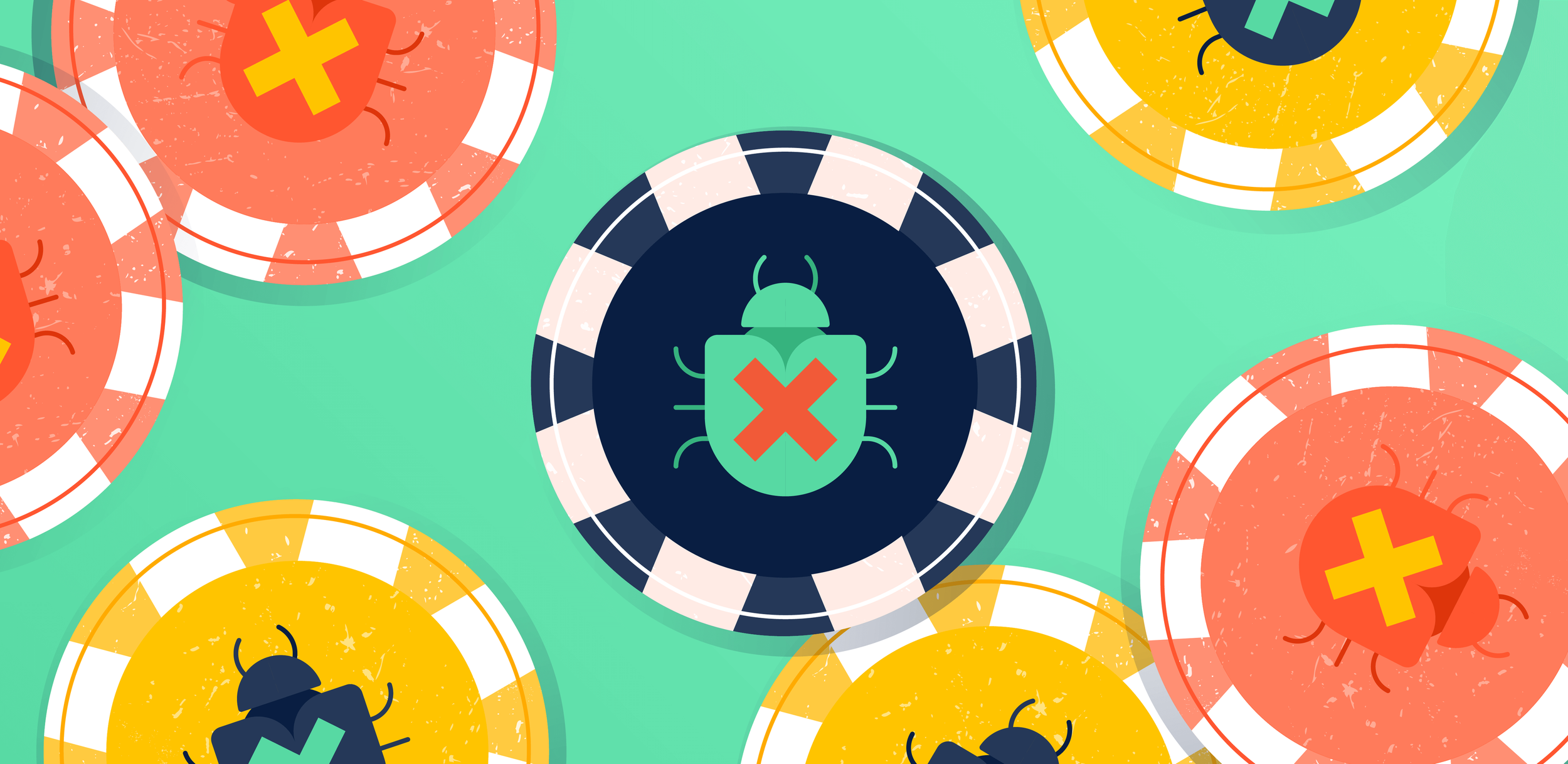
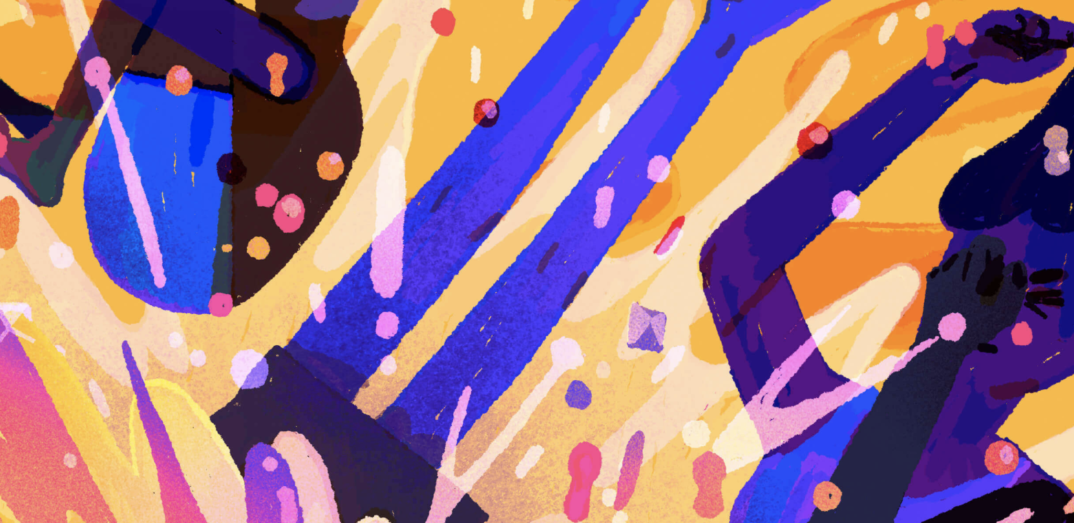
Irregular Pattern
Irregular patterns should fill the frame edge-to-edge, are not repeating (but could be if you were to zoom out). It’s in their general density and lack of a ‘scene’ or perspective that gives them their pattern-like quality.

Grid
Use of the grid is a theme that is present around a variety of Atlassian touch-points. It can simply divide a subject into several perspectives, or create more of a pattern-like composition.

Geometric pattern
Unlike Irregular patterns, geometric patterns are visibly repeating. They also fill the frame edge-to-edge.

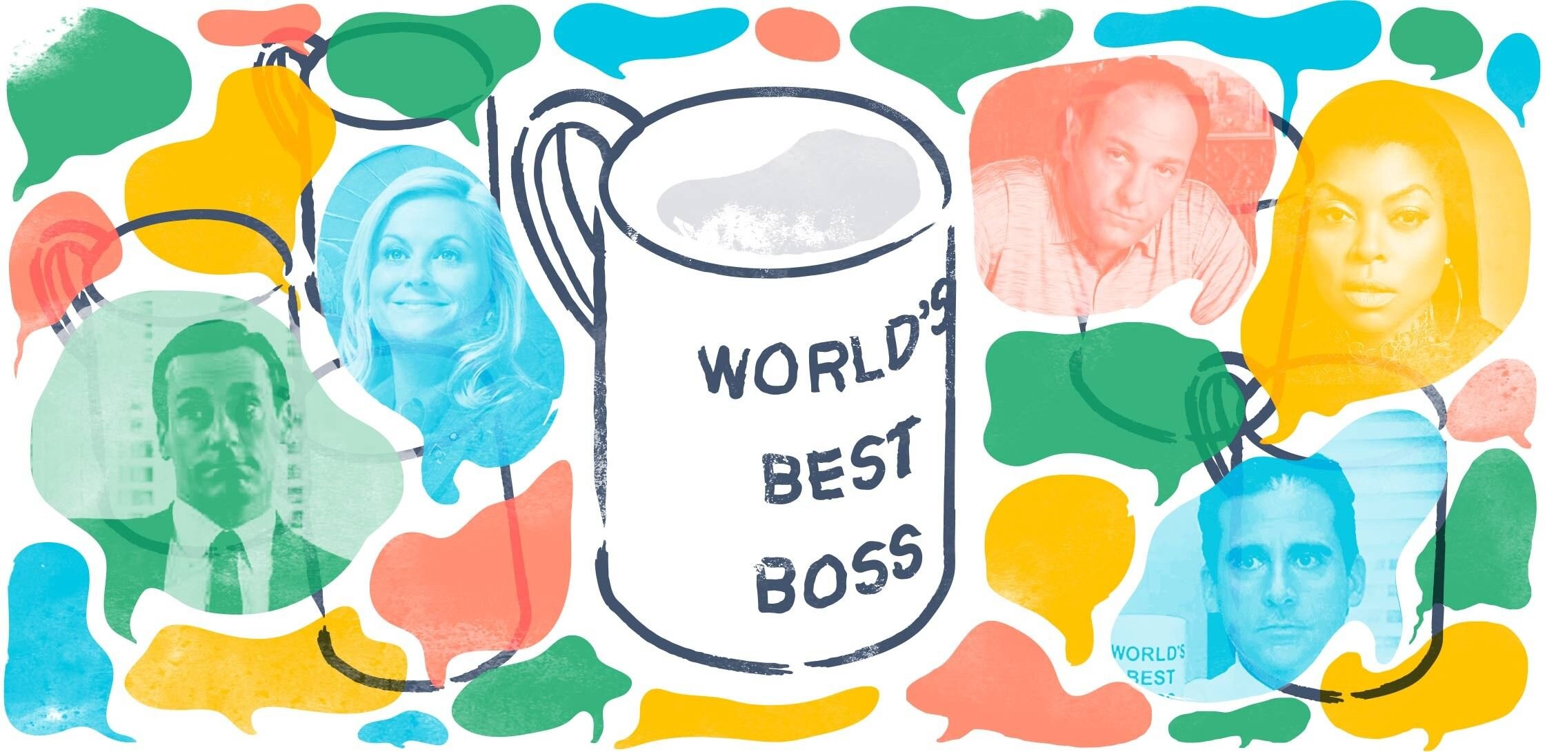
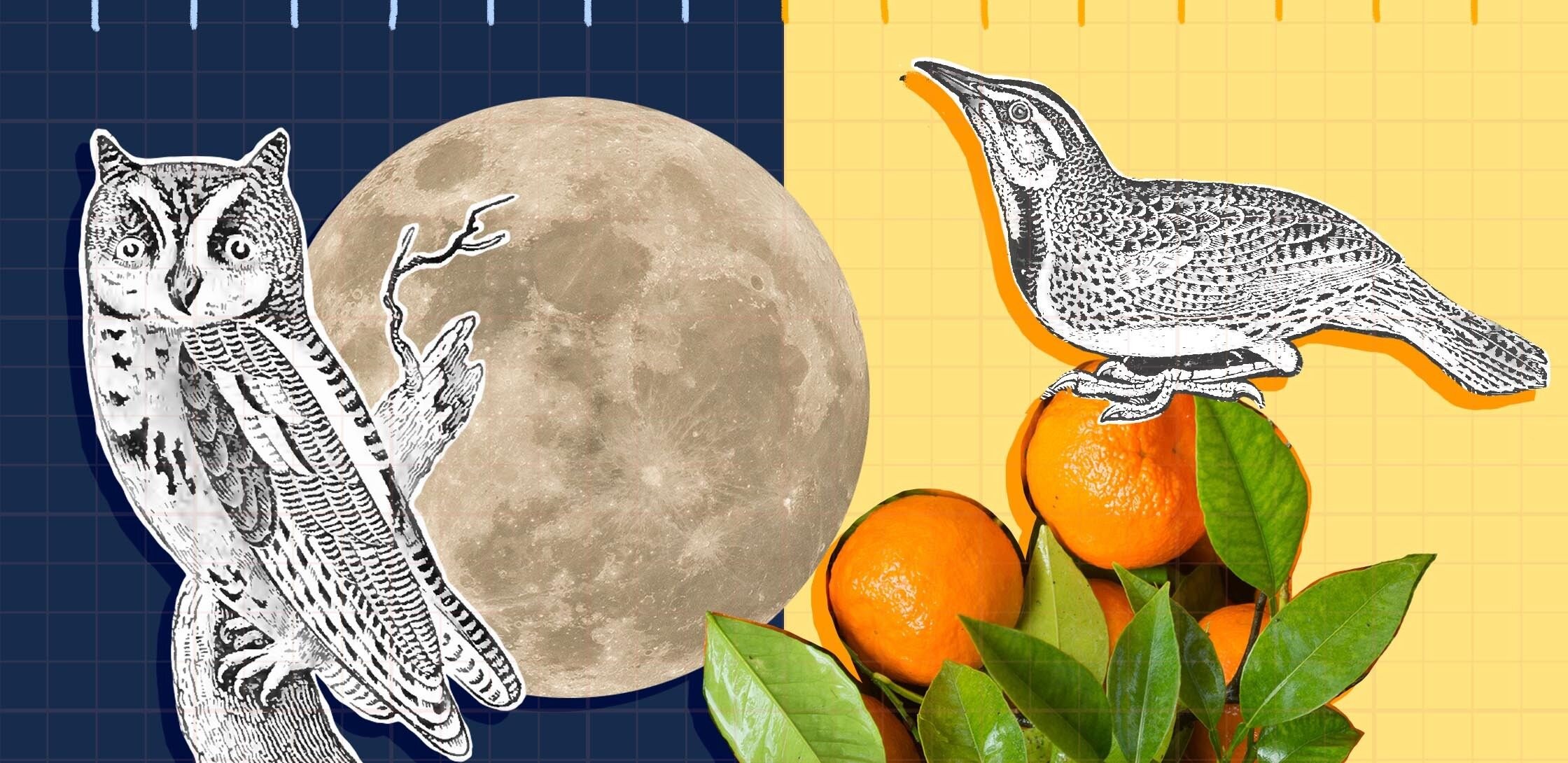
Mixed media
A style that appears to combine multiple different elements; often times they are a mixture of physical and digital elements used in a collage-like way. Collages work best when they’re rather complex, usually 3 elements or more with plenty of overlap and texture.
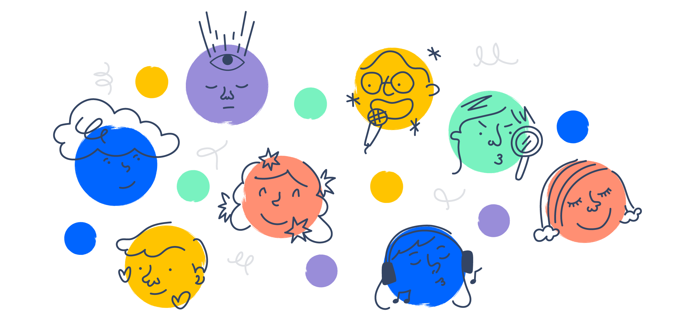
Recurring stylistic elements
These stylistic elements unify our aesthetic beyond subject matter and composition categories above. Within reason, they should be present in every Work Life hero.

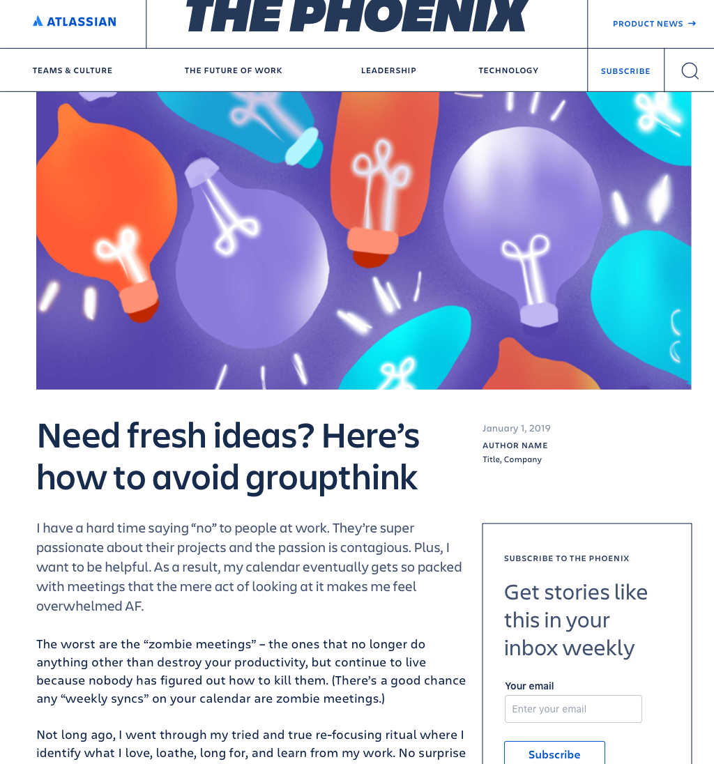
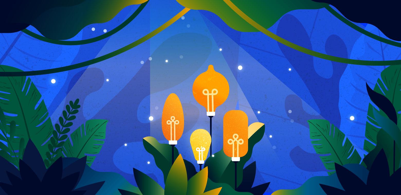
Bold use of color
We should always use the Atlassian color palette, but how you use it is just as important. Color can also be a great way to convey the emotion and tone of the article.

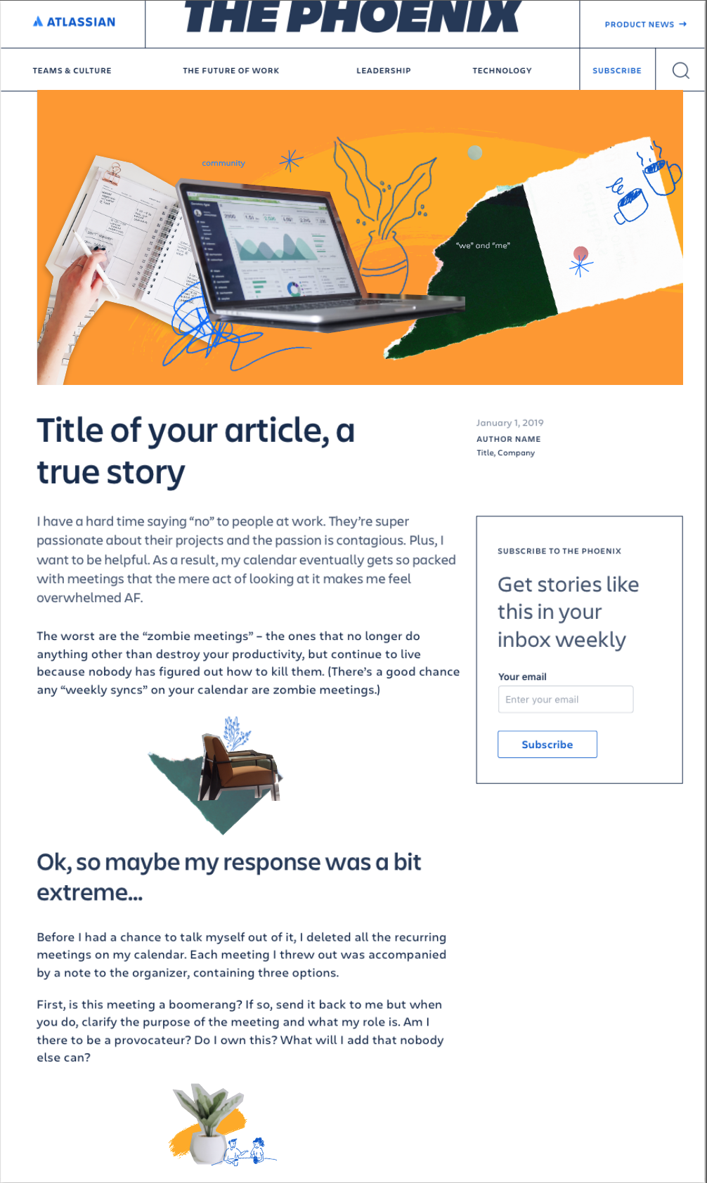
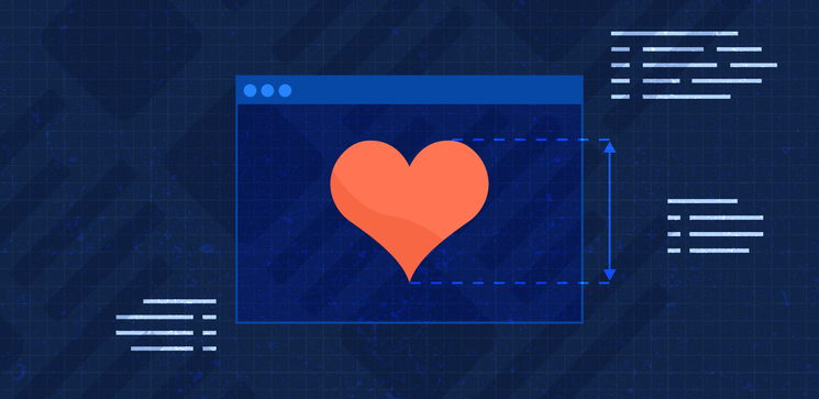
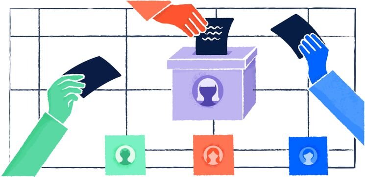
First-person perspective
In first person POV, the viewer should feel like they are looking down or across to their own space or subject, such as their own hands, desk, or screen. Imagery that mimics a computer screen falls into this category.

Mark of the hand
The content of Work Life is intended to speak to the human side of work, so we reflect this in our artwork. There should always be some kind of mark of the hand, whether it's tactility in a collage or just some simple brush or grain texture. Every piece should feel like there was a human involved in the creation.

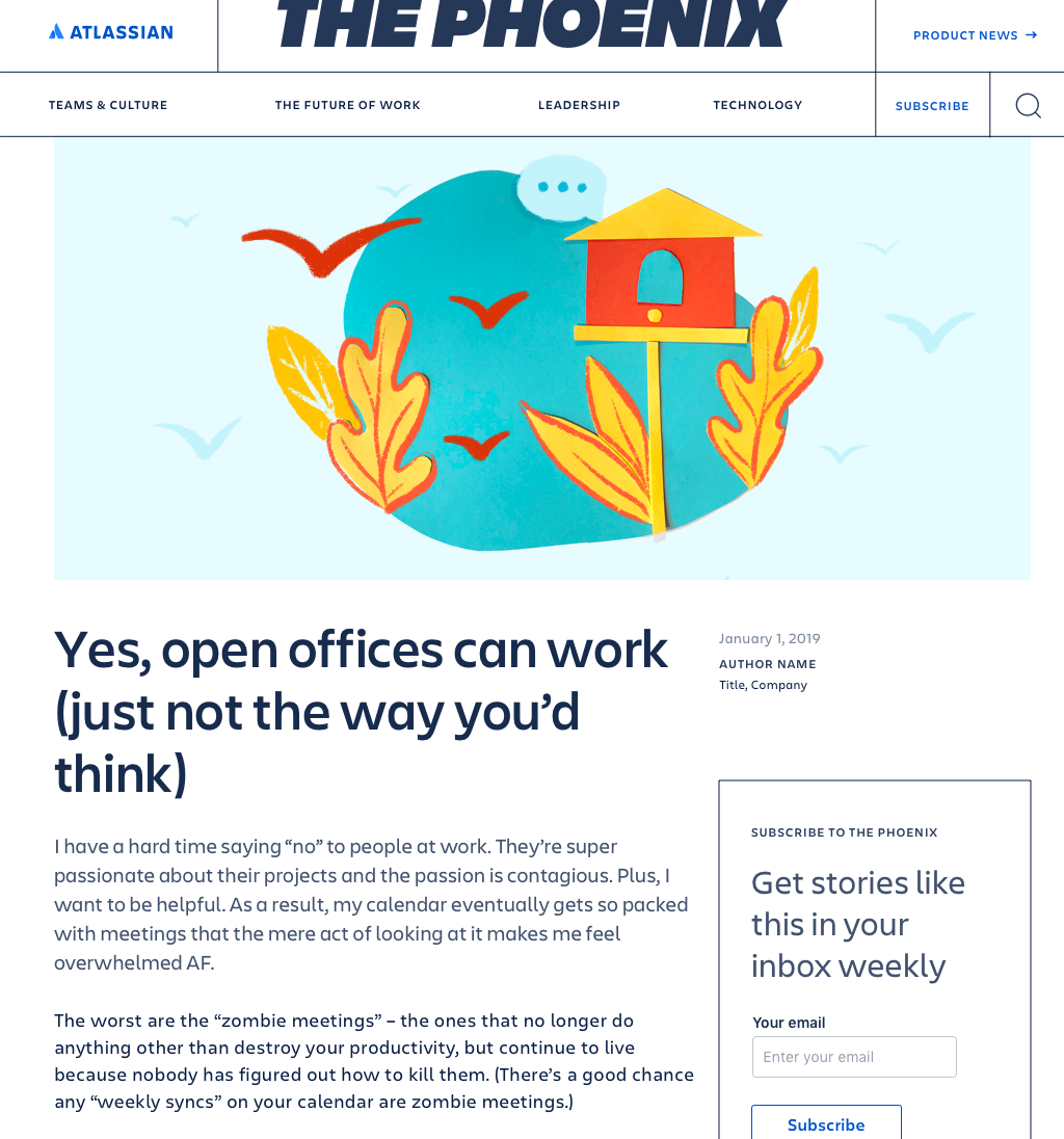
Third-person perspective
In third person POV, the viewer should feel like they are witness to a scene or subject.
Going forward
While we always want to be refining our style, we also want this property to be a proving ground for how we visually express our brand. Therefore, our rules for creating Work Life heroes will always be a bit more loosely held than other areas. We expect to always be converging and diverging and we plan to methodically track what’s working and why. The end goal is to make our visual storytelling in editorial impactful and reflective of our brand.
Credits
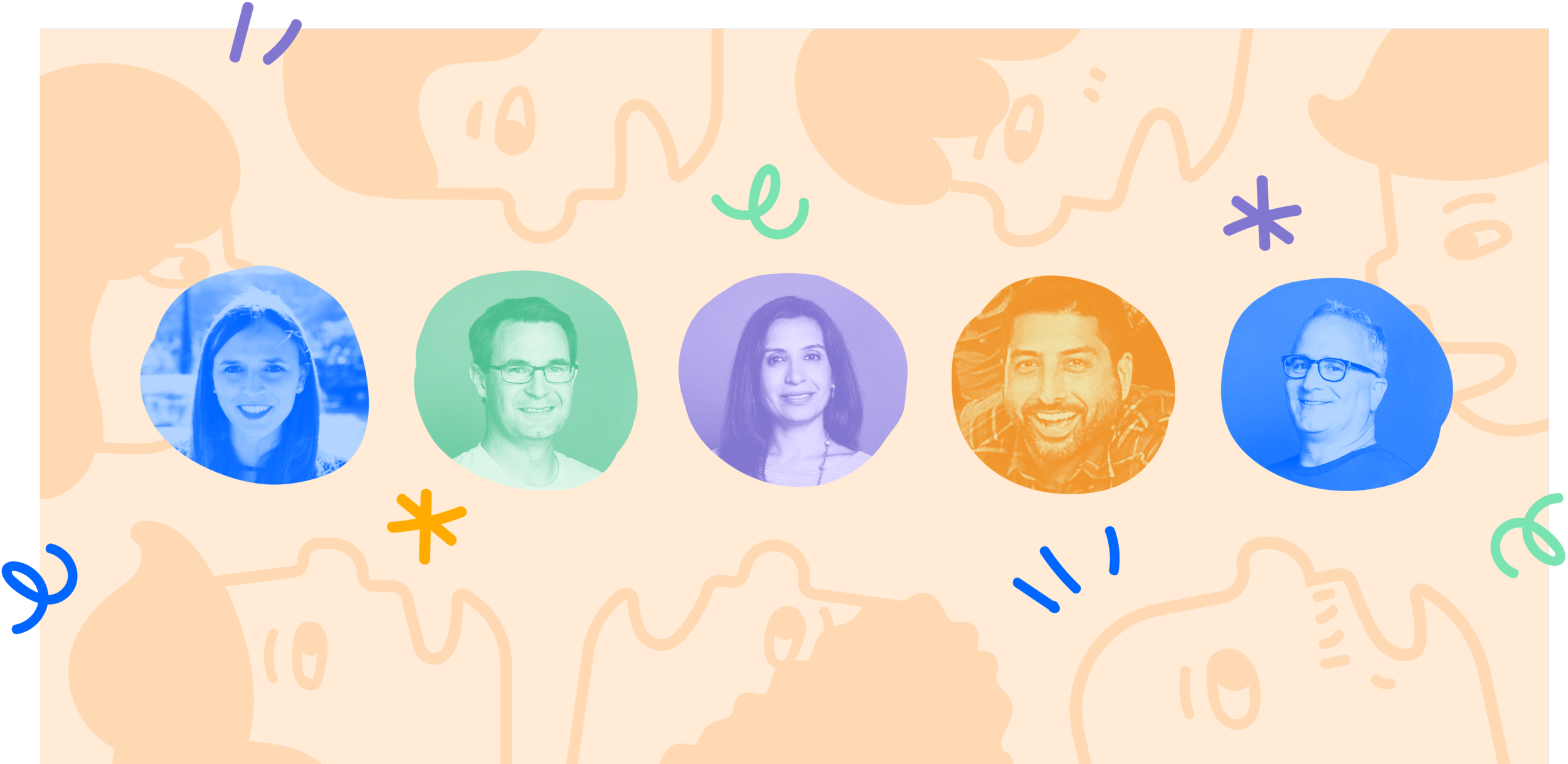
Featured illustrators: Vania Wat, MJ Rowe, Joey Sabio, Sascha Hopson, Brandon Jacobs, Clive Hacker, Cindy Duong, Montse Galbany, Sam Rowe, Antoine Maillard.
Visit the live site, Work Life