Meet Charlie Sans, Atlassian’s custom typeface
As part of our brand refresh we developed a usable and differentiated brand identity, which went beyond just logos. We partnered with OHNO to develop a typeface to replace our logotype and our brand typeface used for functional every day marketing, etc.
Motion design by Kimball Denesto
Scalability
We needed a typeface that could expressively live on banners and billboards, while also being legible and practical in the context of web patterns, blogs, white papers, annual reports, and more, so we developed two styles in the family which gives us plenty of flexibility.
Charlie Sans Display for larger, bolder text, like headlines
Charlie Sans Text for smaller copy and longer bodies of text

Extensibility
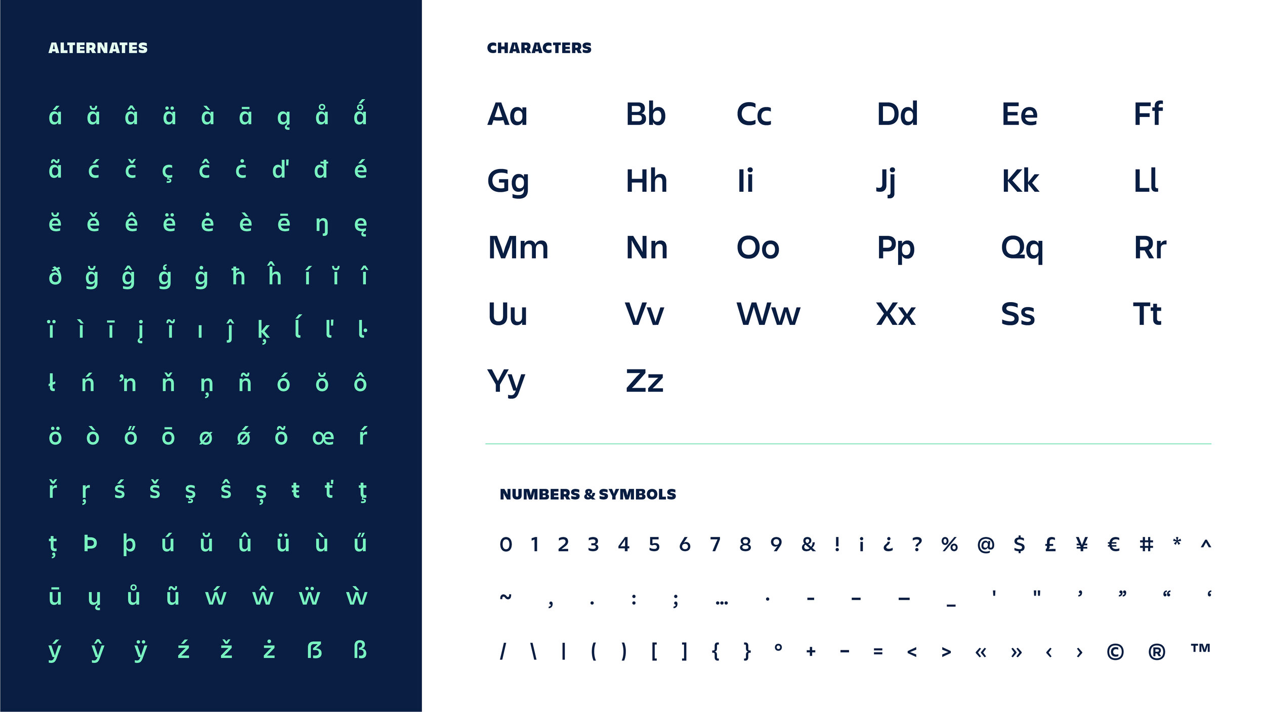
Charlie Sans is an asset created and owned by Atlassian, so we're able to improve it over time. We hope to produce different styles (condensed, monospace, etc) and/or non-Latin/Roman alphabets in the future. Currently, we're able to support all languages with Latin alphabet.
Personality
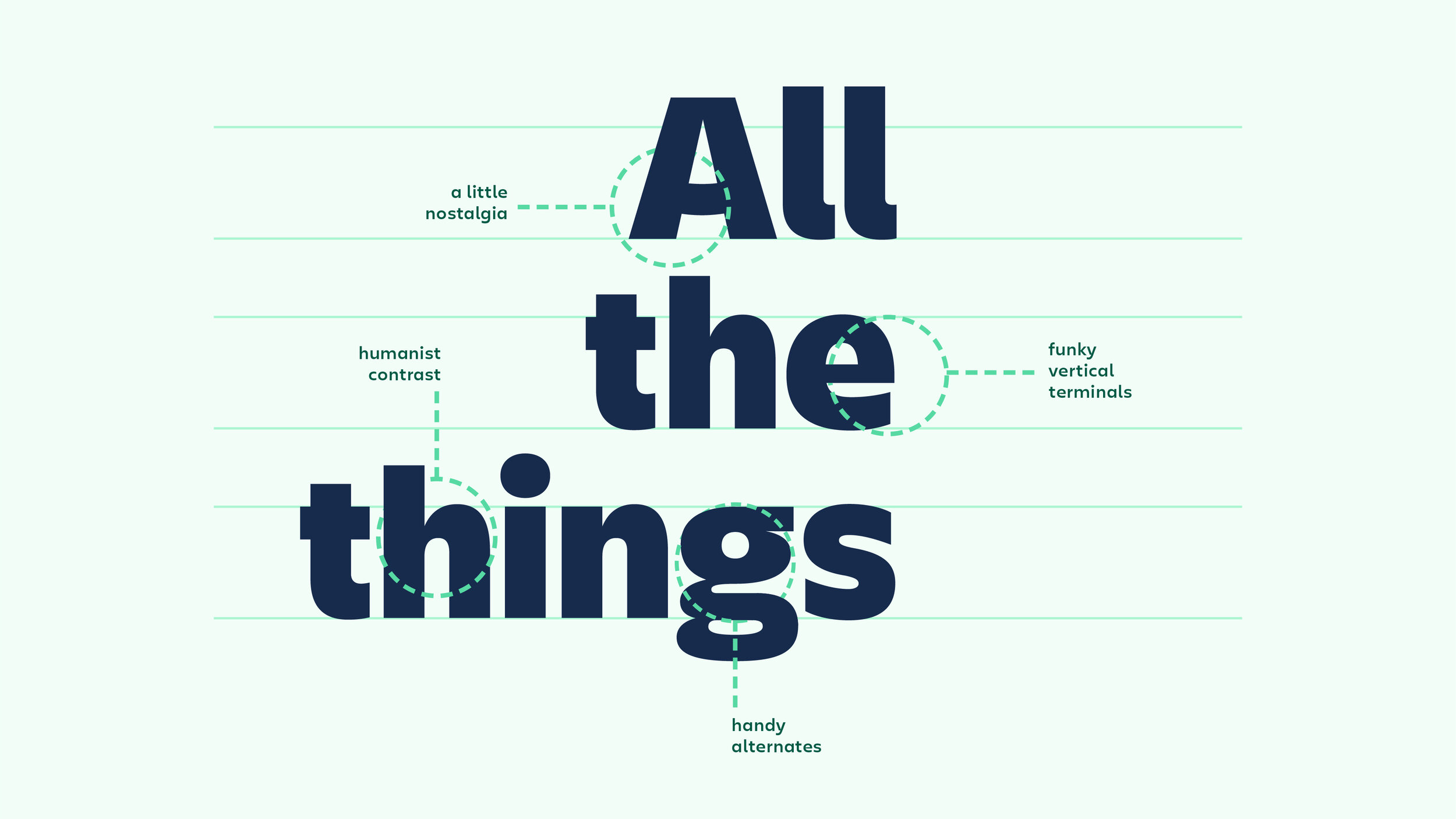
Geometric sans-serifs have been having a moment in the tech space for some time, and for good reason; they're neutral enough to span lots of content types and they tend to be friendly and approachable while still being clean and modern looking. While these elements are important to our brand, we wanted the font to have some character that set it apart from the rest of the sans serifs du jour.
We were deliberate in finding a balance between a font that could be neutral but not boring, expressive but not obnoxious or decorative. It was also imperative we hit our brand personality pillars: bold, optimistic, and practical with a wink. This was a tall, unicorn-like order given our equally important need for legibility and usability.
While Charlie Sans can still be considered a geometric sans-serif, it leans more towards humanist. This makes it more readable for long-form content and gives it its funky edge when used at the bolder weights. Last, but not least, we pay tribute to our history of world class support with a subtle nod to our old logo (Charlie) in the uppercase “A“ character.


Credits
Typeface design: OH no Type Company, James Edmonson—read his case study here.
Animation: Kimball Denesto
Design: Sara VanSlyke, MJ Rowe