
Case study
Defining & scaling Atlassian’s illustration system
Storytelling has been a tool in the human race’s arsenal for a long long time. It’s not a new thing, and brands have caught on. Narratives and metaphors help people understand how something works; it helps them envision their world with the benefit of a product or service. It’s no wonder that tech companies, especially those with a grand vision or complex technologies, have recently turned to illustration to reach more people and facilitate an emotional connection with their brands.

Illustration by Trace Byrd
On a surface, but still important level, illustration can help embody the look and feel of a brand. Using shape, color, texture, depth, scale, etc. we're seeing consistent illustration styles become a critical asset within brand systems—living alongside logos, color palettes, typography, photography, component and pattern libraries, etc. For Atlassian, illustration has always played a role to explain our products, but when we took a hard look at our brand, we found that we needed to say more; specifically about big intangible concepts like complicated teamwork.
Big, scary questions
As illustration rises in the ranks amongst these classic parts of a brand identity system, there are a number of challenges at play, especially as in-house creative teams become the norm. As a brand designer it’s my job to make sure that the foundation of our brand system is as strong as it can be, while ensuring there are plenty of levers at our disposal to keep things fresh and interesting, and as such I was worried about maintaining a consistent style over time. Balancing consistency and relevancy, especially when creating a system that is accessible for an entire company to use, is not simple. A few big scary questions loomed as we set out to redefine a scalable illustration style: even if we were to develop the perfect style, how might we ensure that it won’t look dated or stale in a few years? If we push too hard to stay on the edge, how might we avoid falling into trends? Even if we were to hire a prolific illustrator on the team full time, how might we ensure that we always have someone on staff to execute illustration in the same way? Even if the style was easily replicable, how might we attract talent to execute on another illustrator’s style? Should we dumb down the style for the sake of easy replication?
We certainly didn’t answer all of these questions in our process but we moved forward. Thankfully, we had plenty of history and past experiments to reference.
History of storytelling at Atlassian
These big scary questions didn’t come out of nowhere. It wasn’t Atlassian’s first time taking on this challenge, and I carried a bit of baggage (aka learning experiences) from our previous iterations of our illustration style. While I wasn’t around for all of it, the first thing I did was dig into the archives to understand what had been done before and why.
ADG 0
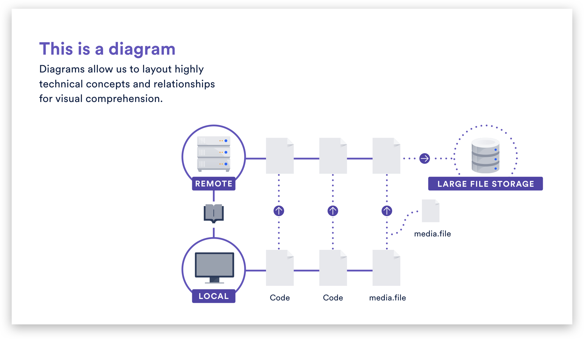
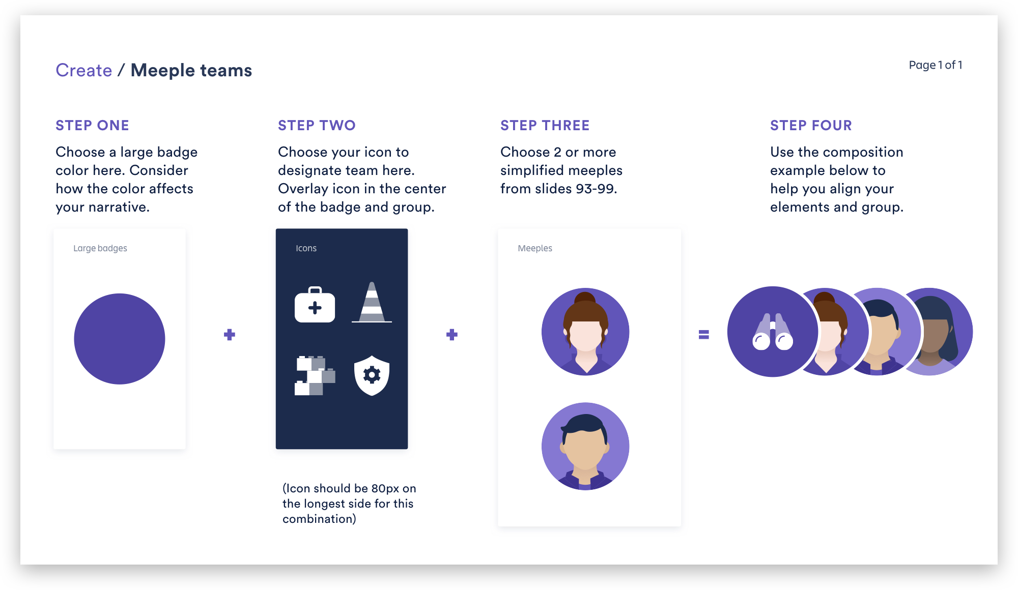
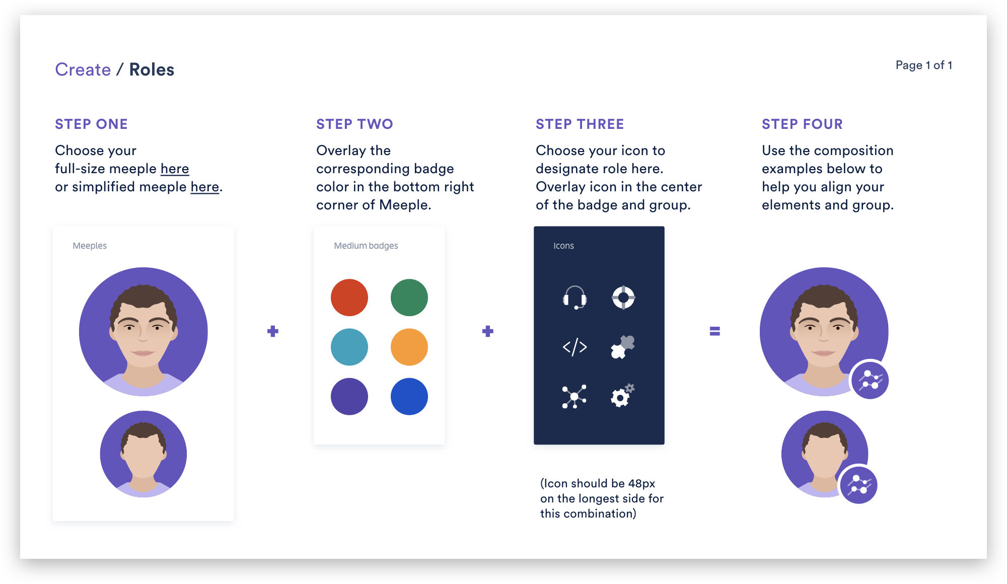
Whenever telling Atlassian’s design story, I like to break it down into the ADG chapters. ADG stands for Atlassian Design Guidelines but should probably be thought of more of Atlassian Design System (inclusive of brand and product design) and it has 4 chapters, starting with ADG 0, when we… well… had no design system. However, design choices were still made. We didn’t really have a formal system but rather a few basic assets that helped tell relatively technical stories. We referred to these assets as meeples.

Meeples were introduced into the system as more of a utility than a brand element. This is really the first time we tried to articulate “teamwork” in a literal and visual way. Around this time, Atlassian was very much a company of developers speaking to a developer audience. Things were literal. A meeple holding a steak to represent a “stakeholder” was as much whimsy as we introduced into our storytelling. Most of our website was text and screenshots, with the occasional 3-D rendering of our then logo doing various things.

ADG 1
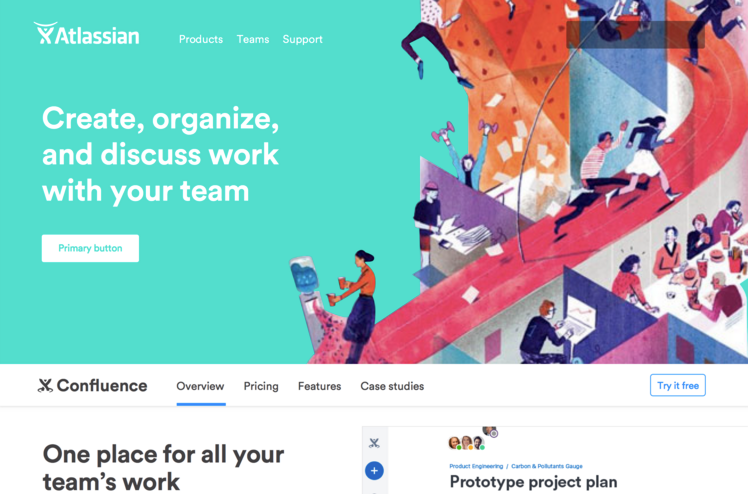
Fast forward to a few years and a few in-house designers later, the team introduced the first intentional look and feel. Atlassian was scaling up, branching out beyond developers, and seeking to diversify from competitors for the first time. Alongside a full brand refresh, true illustrative elements were brought into the system for the first time.
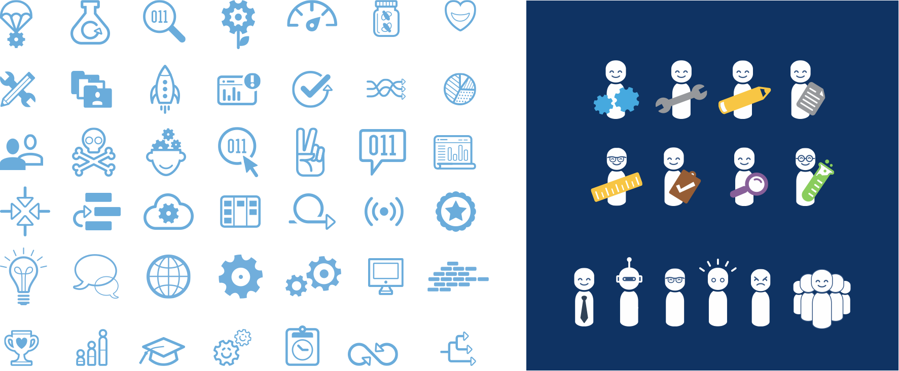
Our meeples were refreshed and a set of graphic assets, mostly icons, were added to the system. While warmer and friendlier, the key goal of assets were still to tell rather technical or process-specific stories.
ADG 2
This system served us well for a few years before we took on our next challenge. Software as a Service (SaaS) companies were starting to think about the user experience beyond just marketing or product but as a single unified brand experience. We needed to address a fairly large discrepancy that we had between our marketing and product languages as a result of siloed work and lack of governance over brand aspects of the system. We used this pressure as an opportunity to explore how we might push the UI design and brand language forward and together for the first time.
Unlike the previous rebrand, we knew we did not want to make a huge change, especially in regards to the logo. This exercise was more about creating components that could span across both marketing and product, allowing the brand to bridge the gap. Therefore, the team was cross-functional and cross-geo, consisting of both marketing and product designers in San Francisco and Sydney. We explored everything from color palette, illustration style, photography, typography, etc. and looked at how these things could work across the whole system.


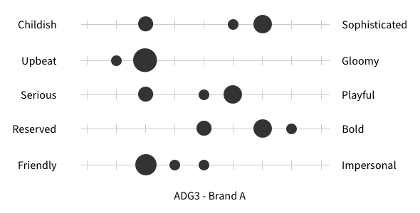
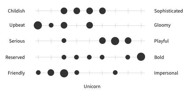
We felt good about a relatively editorial look and feel that you can see in some of the explorations above. However, there were issues, and not the Jira kind. The big one was a disagreement about how our brand personality traits, 'Bold, Optimistic, Practical, and Wink'—which we were using to guide our decisions—translated visually. For some, bold was having actual bold shapes and colors, while some thought it was more about larger than life or epic imagery. Some felt bold meant big, sturdy, or heavy that can be conveyed through colors. Some thought it meant gestural or expressive, conveying emotion. The same problems persisted for 'Optimistic' and 'Practical with a wink.’ Another stumbling block was a lack of a shared understanding around what exactly composed a visual design system. There was a certain expectation that a brand system begins in the logo and is abstracted or interpreted into every application.
Working through our process, we quickly learned that there was a huge amount of buy-in we needed in order to set a real strategy for this. Face-lifts are easy, but making decisions without strategy to back it up becomes subjective very quickly. We struggled with setting a strategy for how we wanted to represent teamwork, what exactly we wanted to own, and how we’d set up or visual toolkit to tell those stories. Product lacked an overall vision as well—their UI was outdated, clunky, and leadership didn’t have the appetite to pour significant money into at the time—which kept us from shipping anything other than changing the color of the navigation bar at the top. At the end of the day, what we shipped was a stripped down, slightly modernized and expanded brand system that brought marketing closer to product, but not a ton of movement across the system as a whole
Overall, ADG2 felt quite anticlimactic. We shipped something we didn’t feel 100% solved the problem, but hey, progress over perfection, right?
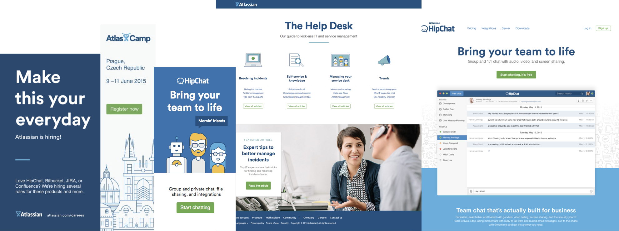
In the spirit of coming closer together with product, we began to share the ADG for the first time. Previously, brand guidelines were considered completely separate from product. If we wanted the product team to be able to leverage or even reference our assets, we had to house them in such a way that made them accessible to everyone. In order to do this, it required us to componentize things like our illustration library. Embracing this habit really helped us achieve a new level of consistency and set us up for a few years later when product was ready to push forward.
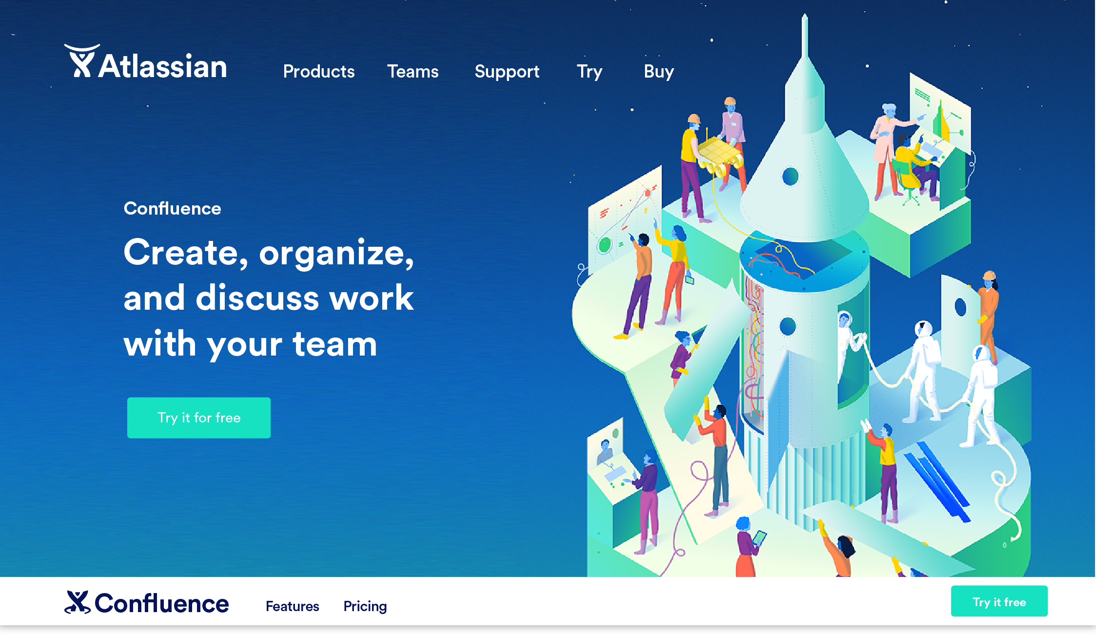
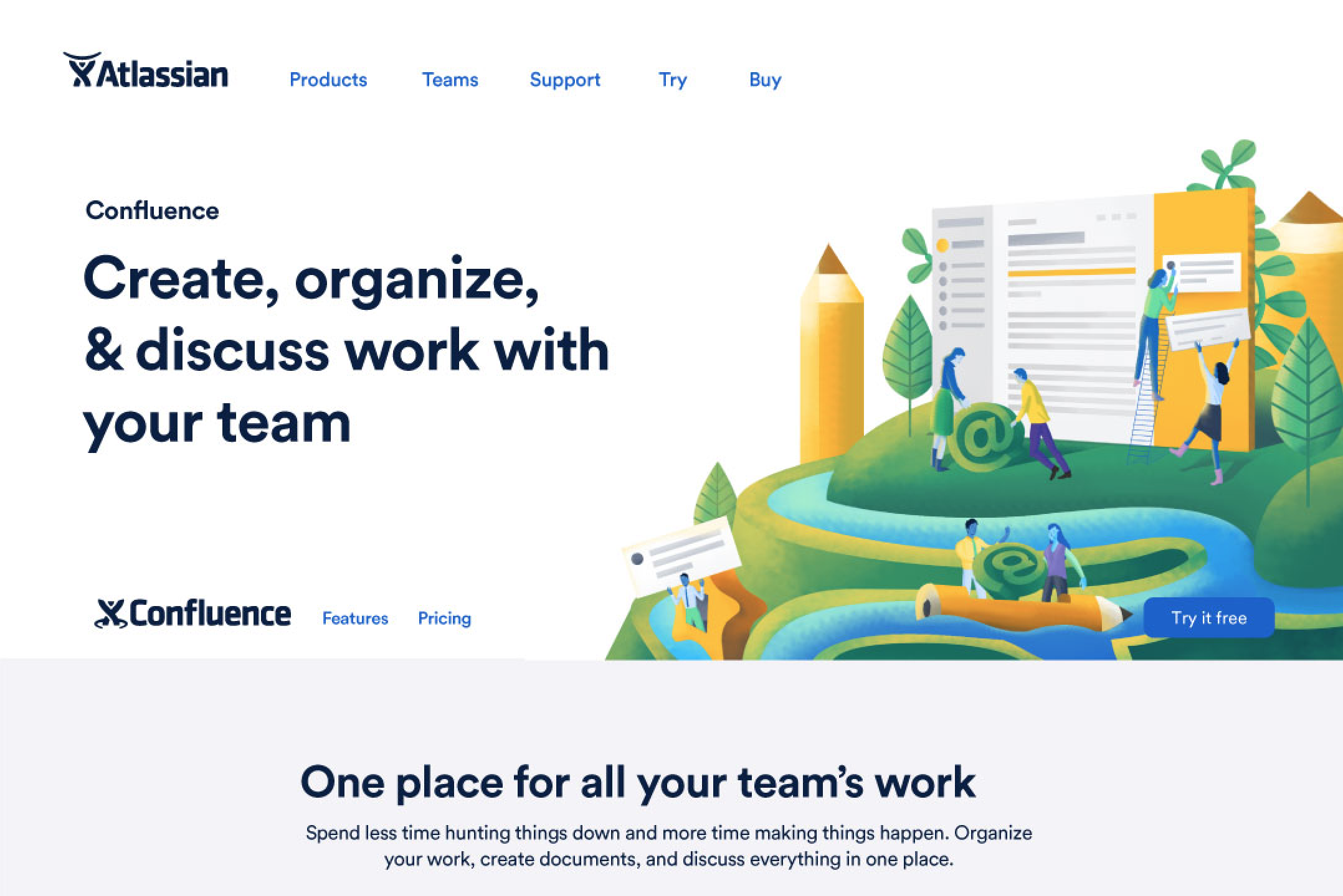
A new era
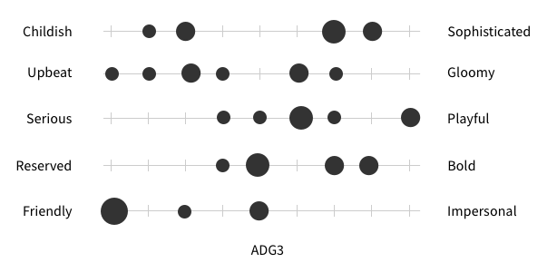
ADG 3
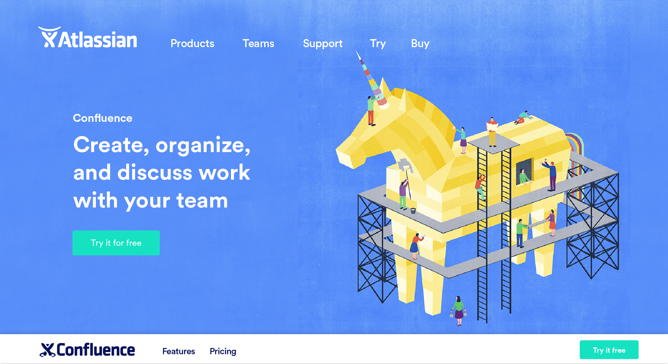
It was a few years since ADG 2 and product was finally ready to push forward in earnest with a full redesign of their UI. We had new leadership in place and a renewed desire to compete with the freshest products in the landscape, many of whose brands were firing on all cylinders. We did some serious soul searching between ADG 2 and 3 and we knew that in order to make a refresh successful we needed to know not only what about teams we wanted to distill into our brand visually, but also what levers we needed to have in order to tell the story all the way from marketing to product.
We started by trying to articulate why teams need Atlassian and how we would communicate that in our storytelling. We traveled across the globe to sit with our product counterparts for four weeks. The first thing we did together was moodboard. Normally a moodboard is intended to communicate a visual idea, but this one was more about a concept than a visual style. The concept moodboard below finally helped us articulate what about teamwork we wanted to own: the messiness and complexity that is inherent when you’re driving towards a shared outcome with more than one person.

From there we went visual; there were hundreds of paths possible from this point. After much discussion and moodboarding on visual direction, we felt that there were two paths that best articulated this narrative platform was the idea of human connection and the bond that teams share when they’re in it together. Or we could focus on the tangible outcome of team work, the feeling of pioneering unchartered territory, discovering something new and staking a claim in the next big thing.

We spent a collective 4 weeks in Sydney with our product and design systems team working through our new illustration style
Moodboard progression

Connection
Embrace the mess and let Atlassian grow with and around you.

Future Frontier
We team up to create, push boundaries, and take risks to reach the edge of the envelope and beyond.
After sparring these options with one of Atlassian’s founders, we realized there were elements of both that we felt were important enough to be included: The boldness of looking ahead while staying grounded in reality and humanity. We went back to moodboard to try to visualize this.

Bold future through an optimistic lens
Taking elements from the previous two directions, there was still something a bit too playful and naïve. It felt too grounded in fun rather than boldness. We attempted to dial up the bold with more contrast and stronger angles.

Bolder future through an optimistic lens
We were getting closer, but we felt that it was near impossible to get both the stylistic elements and the increasingly important content of the illustration summed up in one moodboard. So we split them into two—style and story.

Ready to deep dive
Now armed with a moodboard we were happy with and the beginnings of a (very large) color palette, we briefed three professional illustrators to interpret them together. We asked them to create 1) a place where people collaborate and 2) a tangible outcome of collaboration. The results gave us a lot more to consider.
Artist credit: Shout, Sam Falconer, Neil Webb, Peter Oumanski
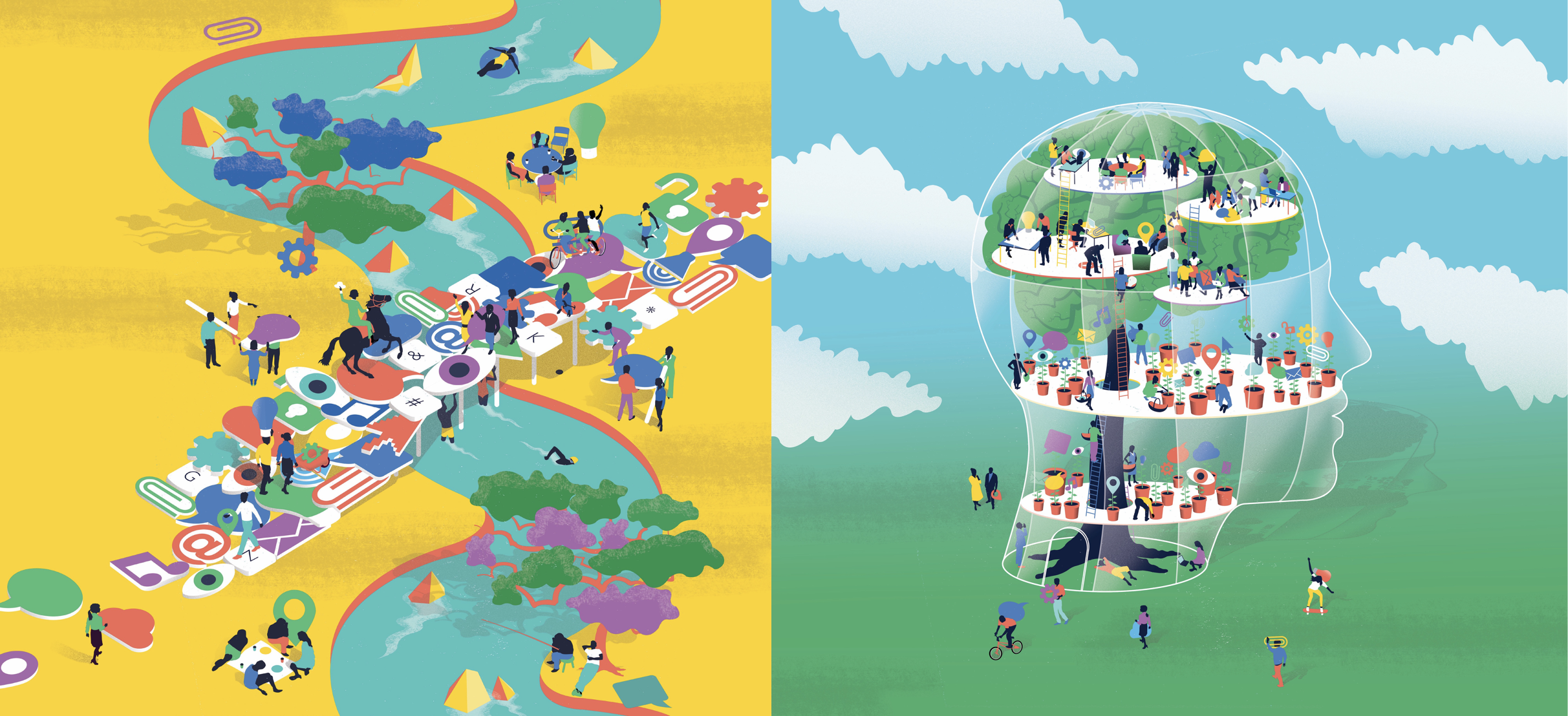
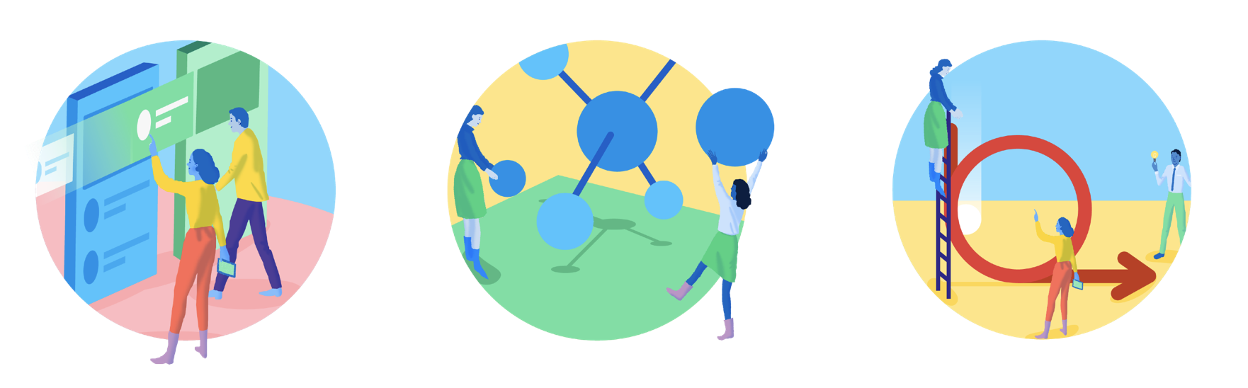
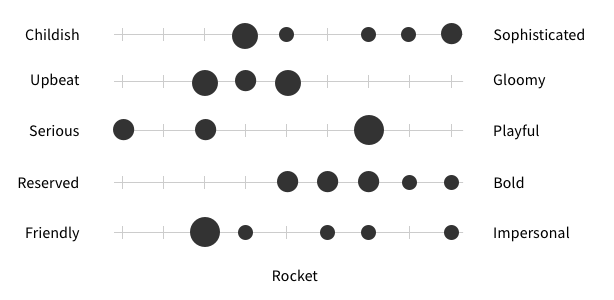
This process helped us realize that we needed more rules around color ratio and that we needed several levels of illustrations rather than just heroes. We attempted to distill what was working and not working about these illustrations. We felt that a sense of dimension and strong use of color felt bold. While color combinations and plenty of airiness felt optimistic. The sense of scale and larger-than-life subject matter felt bold and optimistic. Lots of people coming together to solve big things.
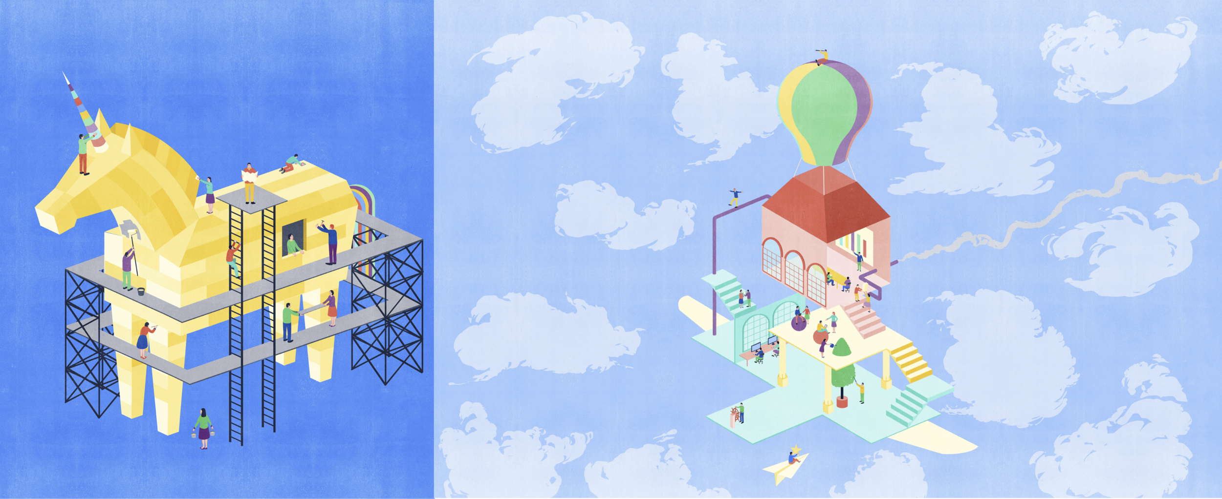
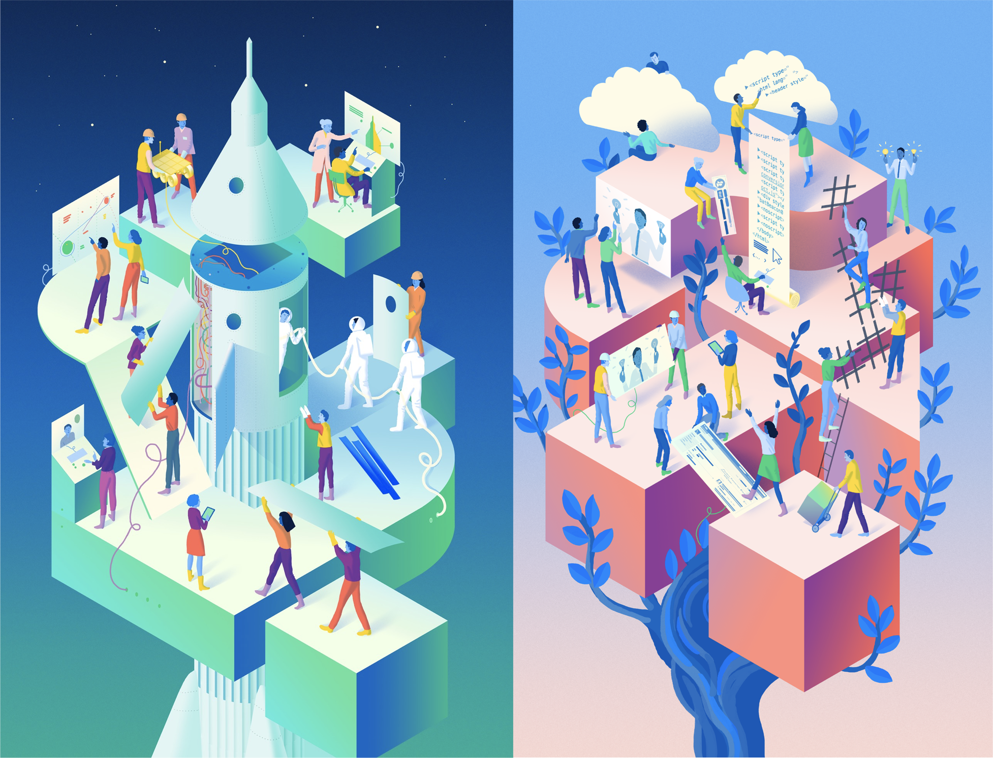
We finally had some original content that we could start testing in different environments and situations. We pulled apart different pieces of the illustrations to see how the elements might work across a spectrum and started playing with color ratio, dimensionality, light source, and metaphor.
This was all fine and good in theory, but the real test was putting the work into real scenarios where it would be every day. We asked ourselves if it conveyed our message, if it stood out from the noise, and most importantly, did it feel like "us?"
Testing
We were lucky enough to have a dedicated researcher on this project, so we had the opportunity to get feedback from real live people. These tests helped us understand whether or not we were hitting on the emotions we were hoping to evoke.
Finding repeatability
As we circled a solution, we were still haunted by a lack of a repeatable element. We continued to struggle with the color ratio but felt that if we could just crack the code of the right colors and right balance of them, color could be a strong enough repeatable element across the entire system, especially since we landed on a palette that was shared with product.

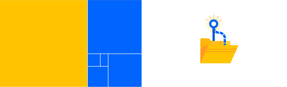
We also attempted to bring an aspect of our logo,which at the time was unchanged, into the system. The “repeatable element" was the curve that exists within Charlie as well as other important symbology within our space, like agile, devops, and git. It could also represent flow, momentum, and process more widely.


We also explored a variety of other elements, from severe isometric perspective, to mark of the hand, gradient, and more.

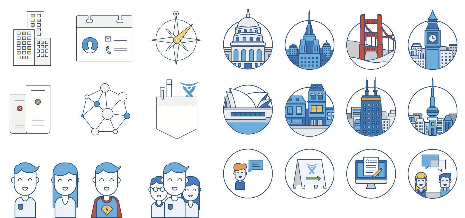
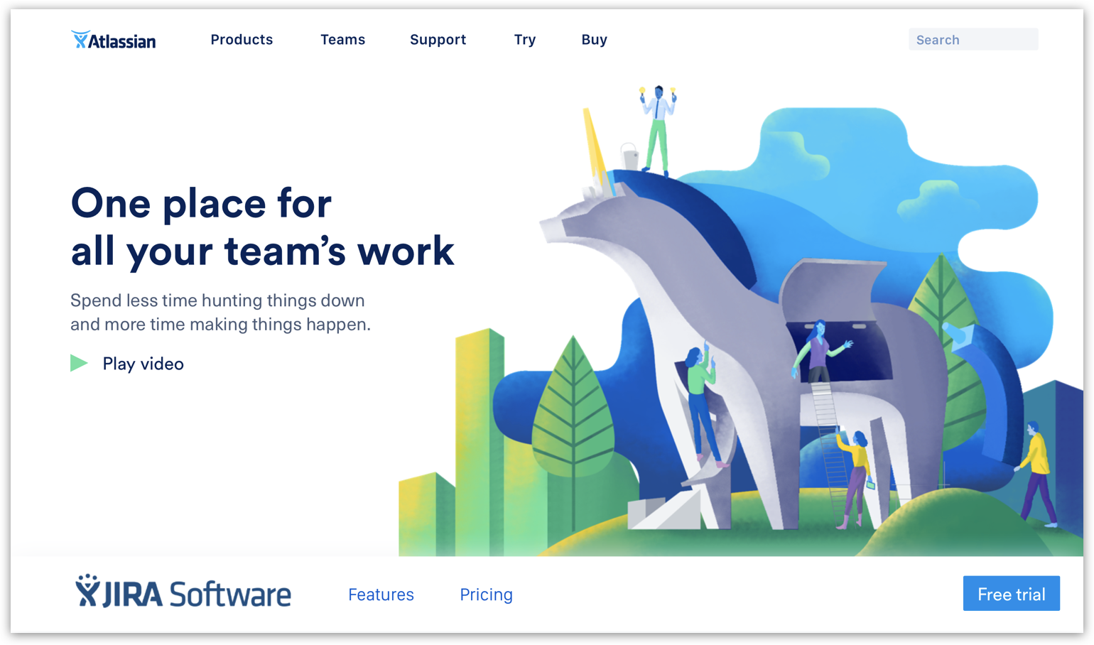
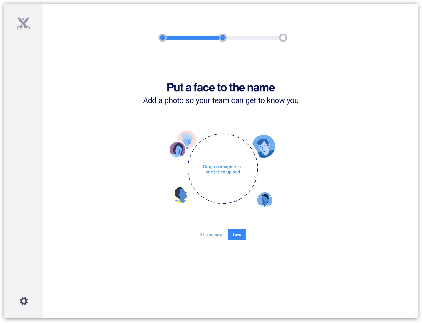
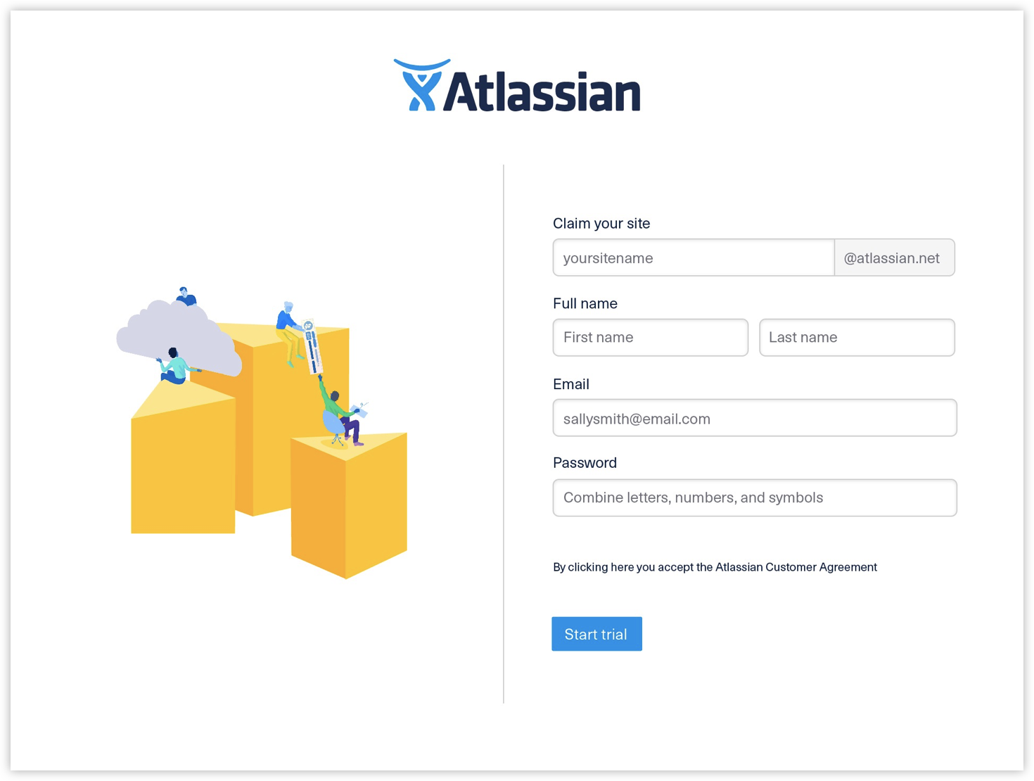
Eventually we felt that we had exhausted most of what we felt was viable and we were inspired by the scalability of the curve direction to perform in both subtle and bold ways. As we honed in our final illustration style and color palette, it became important to make sure that the system was rooted in concrete decisions rather than gut feelings. We took a stab at writing rigid guidelines against every decision we made, from the use of depth, the use of blue, corner radius, light source and everything in between. We also started to iron out more specific details around meeples, their body types, faces, clothing, and more. We worked hard to make our meeples as inclusive as possible which is worth a case study of its own.


What we shipped
With all of the levers in place, we were slowly but surely able to work towards the deliverables of the system. While we checked everything against our brand pillars and our narrative platform, we found that we had to define more granular principles specific to each application. For instance, while color definitely had to be bold, optimistic, and practical, we also had to hold ourselves to things like being ADA compliant, and we definitely wanted to have a palette that felt ownable and propriety to us.

While we felt that the palette on its own would do a great job serving all of our color needs, its in it’s usage that it really feels Atlassian. We developed a simple ratio using the golden rectangle to help us keep it in balance no matter how complex the illustration.
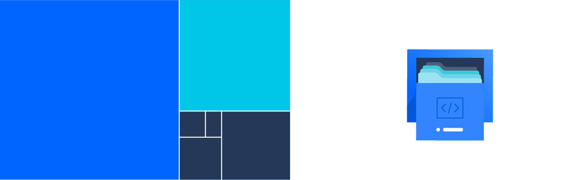
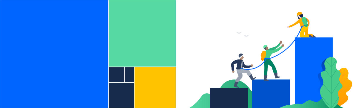
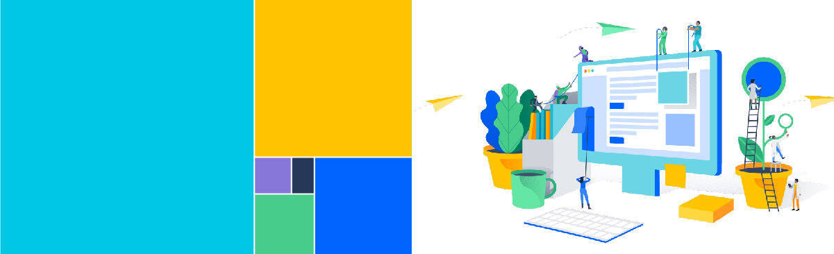
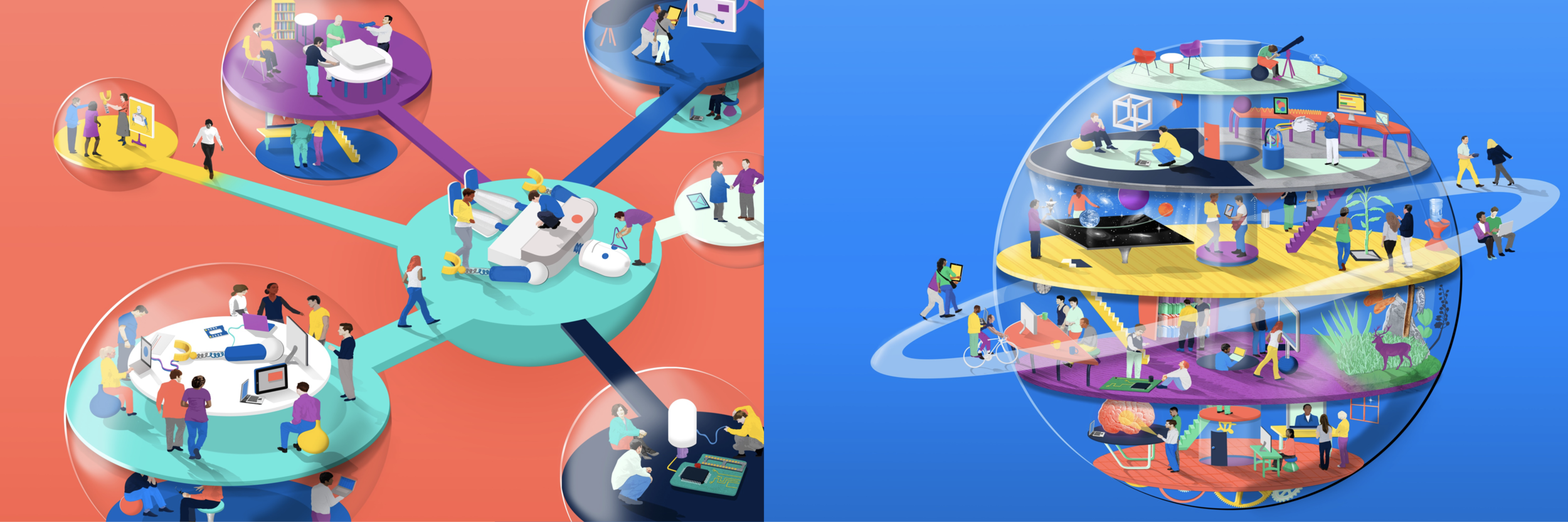
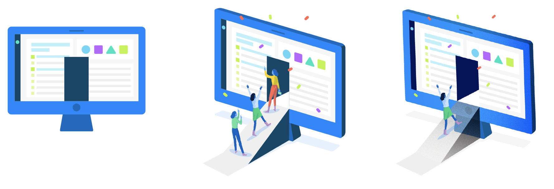
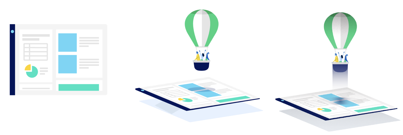
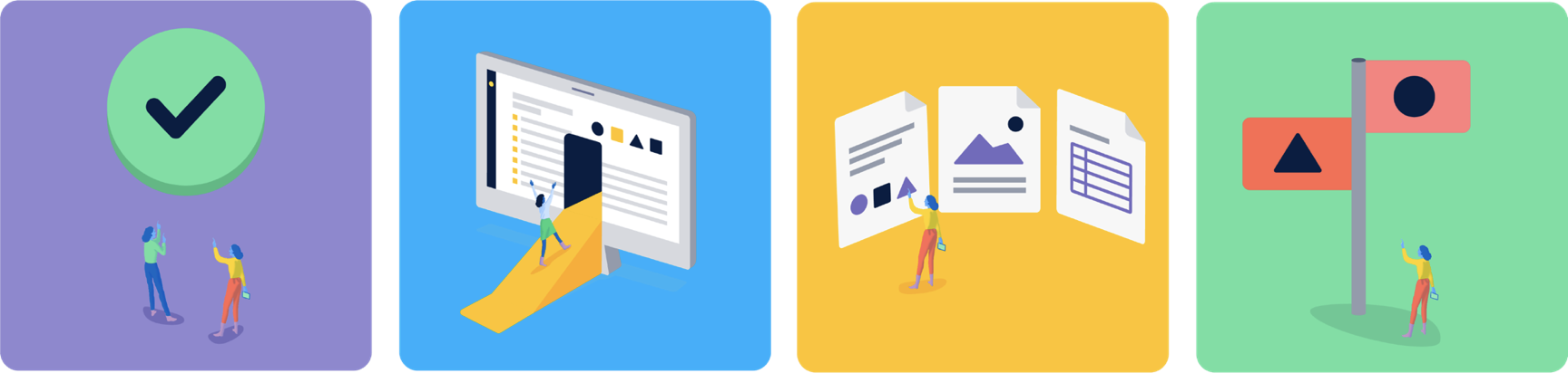
For the illustrations themselves, we knew that flexibility was one of the biggest characteristics we needed the new suite of assets to have. We required illustrations that could speak to both high-level concepts of teamwork, while still being able to complement more direct and literal concepts like “permissions”. Flexibility is especially important because we know that this system must serve our internal clients and the messages they need to convey, and those people are not usually designers. To achieve this, we created three distinct categories within our illustration spectrum. Each type serves a different purpose. Heroes and spot heroes are both on the larger and more metaphorical side while spots can be more literal when they need to be.

Educating our audience
Then came the hard part—rolling it out. Since Atlassian is an incredibly open company, we knew that our assets would not be kept safe in a lock box and they’d be in the hands of non-designers on a daily basis, so we had to be incredibly strategic about the tools that accompanied the assets. The most important item on the list was our design site—a single source of truth for not only guidelines, but also assets for download. We did user testing with some internal stakeholders to get an understanding of their thought process when using illustrations in things like Keynote presentations and social media. This greatly informed our guidelines.
When we were ready to launch, we released our illustration library, but mostly in the context of our presentation kit. This gave us the ability to control (to a degree) our illustration usage, typography, layouts. The guidelines live right alongside, so consuming them both simultaneously is more likely to happen. Finally, we recorded several tutorial style videos and gave live presentations in our largest offices. These tutorials covered everything from system basics, to using metaphor, portraying inclusive teams, and creating infographics. You can watch the tutorials on atlassian.design.

Scaling over time
In the last two years since rolling out our illustration system, we’ve had designers and illustrators come and go, but we’ve been able to continue to produce high quality and consistent illustrations. Our initial release included over 200 unique illustrations that we’ve been able to adapt into hundreds more. By adhering to strict documentation practices and hiring for illustration skill, we’ve grown our library and even produced several campaigns with unique spin offs of the style. We have even developed a looser editorial adaptation of our illustration for our blog, Work Life (see case study). This certainly doesn’t mean we’re done. As important as illustration is to our brand, it is certainly the element that we expect to change the most over time. Thanks to the thought and effort that went into every decision, we feel confident that we have the right levers in place that we need make change incrementally and gracefully.
Credits
Major credit to go to many talented folks who worked on this project: Trace Byrd, Maryanne Nguyen, James Rotanson, Rose Yount, and Leah Pincsak.